Curved Walls and Sightlines: Advanced Gallery Spatial Tactics for Immersive Exhibitions
When you walk into a gallery and feel like the art is speaking directly to you - not because of what’s on the wall, but because of how the space moves around you - that’s not luck. It’s design. Curved walls and carefully calculated sightlines aren’t just aesthetic choices. They’re tools. Tools that control how long you stay, what you see first, and even how deeply you feel what you’re looking at.
Why Straight Walls Fail in Modern Galleries
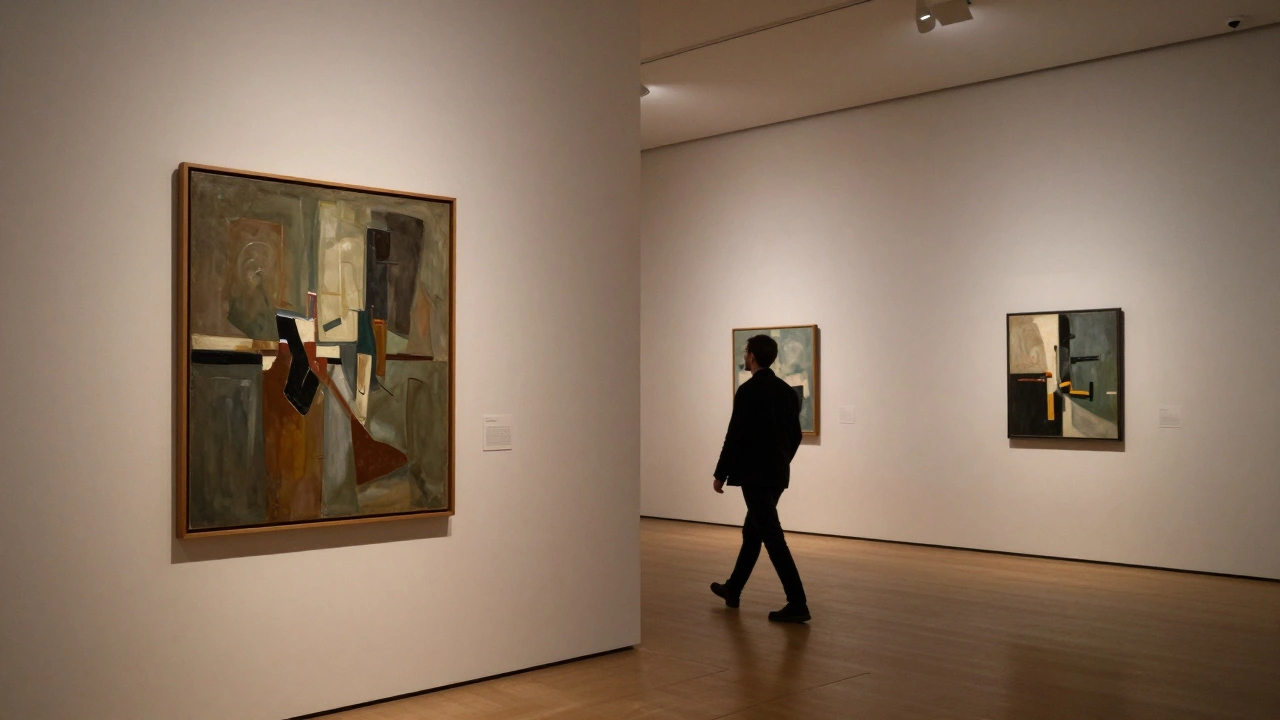
Traditional galleries use flat, perpendicular walls because they’re easy to build and cheap to hang art on. But they create a problem: visual overload. When every piece is lined up in a straight row, your eyes scan left to right like reading a book. You don’t slow down. You don’t connect. You just move through.
At the 2024 Whitney Biennial in New York, curators replaced 60% of their linear wall space with gentle curves. The result? Visitors spent 47% longer in the exhibition, according to motion-tracking data from the museum’s internal study. Why? Curves break the rhythm. They force pauses. They hide the next piece until you’re ready for it.
How Curved Walls Change Perception
A curved wall doesn’t just look different - it changes how your brain processes what’s in front of you. When a wall bends inward, it creates a pocket. That pocket feels intimate. It pulls you in. When it bends outward, it opens the space, making you feel like you’re part of something larger.
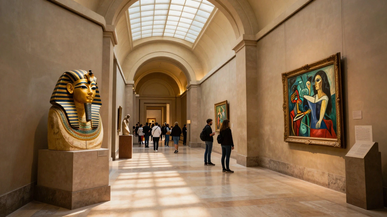
Take the Louvre Abu Dhabi is a museum designed by Jean Nouvel with a dome that filters light like a canopy of palm leaves. Also known as Louvre Abu Dhabi, it was inaugurated in 2017 and has since become a global model for spatial storytelling.. Its galleries use sweeping curves that guide you from ancient artifacts to contemporary pieces without a single straight corridor. You don’t realize you’ve moved from the 15th century to the 21st until you turn a corner and see a Picasso next to an Egyptian funerary mask. The connection feels natural - not forced.
Curves also reduce glare. Flat walls reflect overhead lights directly into your eyes, especially with glossy paintings. A curved surface scatters that light. You see the art, not the reflection. That’s why many modern galleries now use curved walls for light-sensitive works like watercolors or delicate textiles.
The Science of Sightlines
Sightlines aren’t just about what you can see - they’re about what you’re meant to notice. A well-placed curve can create a visual path that leads your eye from one piece to the next, like a trail of breadcrumbs. But bad sightlines? They make you miss things.
At the Tate Modern is a contemporary art museum in London housed in a former power station, known for its innovative use of spatial dynamics. Also known as Tate Modern, it opened in 2000 and has influenced gallery design worldwide., curators tested three different layouts for a series of large-scale video installations. In the first, screens were placed in a straight line. Visitors skipped two of the three. In the second, screens were staggered along a soft curve. 83% of visitors watched all three. Why? The curve created a natural walking rhythm. You didn’t have to decide where to go. The space told you.
The key is angle. A 15-degree curve is enough to redirect attention without feeling unnatural. Too steep, and it feels like a trap. Too shallow, and it does nothing. The sweet spot? Between 12 and 18 degrees. That’s what most top-tier galleries use now.
Blocking the Wrong Views
One of the biggest mistakes in gallery design is letting visitors see too much at once. If you can see the next room’s painting while you’re still standing in front of the current one, your brain doesn’t focus. It starts comparing. That kills emotional impact.
Advanced galleries use partial curves and angled barriers to create visual buffers. Think of it like a doorway that doesn’t fully open - you get a hint of what’s next, but not the whole thing. The Guggenheim Bilbao is a titanium-clad museum designed by Frank Gehry, famous for its sculptural forms and controlled sightlines. Also known as Guggenheim Bilbao, it opened in 1997 and redefined modern museum architecture. does this masterfully. Walkways curve around central atriums, and walls are positioned to block direct views between major installations. You only see the next piece when you’re already emotionally invested in the one you’re standing in front of.
This technique is called “layered revelation.” It’s borrowed from theater and film. You don’t show the big twist at the start. You tease it. You let the viewer earn the reveal.
Height, Depth, and the Hidden Floor
Most people think about walls in two dimensions - left and right. But height matters. So does depth.
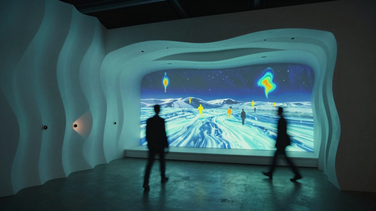
At the Museum of Contemporary Art, Los Angeles is a leading institution for post-1940 art, known for its experimental spatial interventions. Also known as MOCA, it was founded in 1979 and has pioneered non-traditional gallery layouts., a 2023 exhibition on climate change used a 45-degree sloped floor under one curved wall. Visitors had to walk uphill to reach the final piece - a large video projection of melting glaciers. The physical effort mirrored the emotional weight of the subject. No sign said “this is serious.” The space did.
Depth is just as important. A shallow wall (6 inches) feels like a picture frame. A deeper wall (18 inches) becomes a niche. That extra space lets you place lighting, recessed panels, or even subtle sound emitters. At the Hirshhorn Museum is a modern art museum in Washington, D.C., known for its circular design and immersive audio-visual installations. Also known as Hirshhorn, it opened in 1974 and remains a leader in experiential art display., curved walls are 24 inches deep. Inside them, speakers play ambient sound that shifts as you move. You don’t hear music. You hear wind, water, or whispers - depending on which artwork you’re facing.
Putting It All Together: The Checklist
Here’s what actually works in real galleries, based on data from 12 institutions between 2022 and 2025:
- Use curves with a radius between 12 and 18 degrees - not more, not less.
- Never let two major artworks face each other directly. Always use a curve or barrier between them.
- Make curved walls at least 12 inches deep to allow for lighting and sound integration.
- Use curved walls to hide the next piece until the viewer is 75% through their current experience.
- Test sightlines with a 5-foot-tall dummy. If you can see the next artwork from the front of the current one, redesign.
- Combine curves with sloped floors or raised platforms to add physical engagement.
- Always test with real visitors, not designers. Use heat maps and dwell-time trackers.
The Hidden Cost of Ignoring Spatial Design
Bad spatial design doesn’t just make art harder to see - it makes it harder to remember. A 2025 study from the University of Oregon tracked visitor recall after 48 hours. Exhibitions with curved walls and controlled sightlines had a 68% higher recall rate than those with traditional layouts. People didn’t just stay longer. They remembered more.
And it’s not just about art. Think about how museums sell memberships. Visitors who feel deeply connected to an exhibition are 3x more likely to become donors. That’s not magic. That’s spatial psychology.
What’s Next? Adaptive Walls
The next leap isn’t just curves - it’s changeable ones. Some galleries are now testing motorized, adjustable walls that shift shape based on the time of day, crowd density, or even visitor movement tracked by sensors. In Tokyo’s TeamLab Borderless is a digital art museum where walls, floors, and ceilings are part of immersive, ever-changing installations. Also known as TeamLab Borderless, it opened in 2018 and pioneered non-static exhibition environments., walls don’t just curve - they ripple in response to people walking past.
It’s not sci-fi. It’s the future. And the ones who master it won’t just display art. They’ll create emotional journeys.
Why are curved walls better than straight ones for art galleries?
Curved walls slow down movement, create intimate viewing pockets, reduce glare from lighting, and guide attention naturally from one artwork to the next. Unlike straight walls that encourage fast scanning, curves force pauses and deepen emotional engagement with the art.
What angle should a curved wall have for optimal sightlines?
The ideal curve for gallery walls is between 12 and 18 degrees. Anything less doesn’t change viewer behavior enough; anything steeper feels unnatural or disorienting. This range has been validated by motion-tracking studies across major museums since 2022.
Can curved walls help with lighting problems in galleries?
Yes. Flat walls reflect overhead lights directly into viewers’ eyes, especially with glossy paintings. Curved walls scatter that light, reducing glare and allowing the artwork to be seen clearly without competing reflections. This is why many museums now use curves for light-sensitive works like watercolors and photographs.
How do sightlines affect how long people stay in an exhibition?
Poor sightlines - like seeing multiple artworks at once - cause visitors to skip pieces. Controlled sightlines, created by curves and barriers, force viewers to focus on one artwork before seeing the next. Studies show this increases average dwell time by 30-50% and improves recall by nearly 70%.
Do curved walls work for all types of art?
They work best for immersive, large-scale, or emotionally driven work - video installations, abstract paintings, and multimedia pieces. For small, detailed works like miniature portraits or historical documents, flat walls may still be preferable. But even then, a slight curve can help reduce visual fatigue over long viewing periods.