Art Gallery Photography: How to Capture Pro Images for Web and Print
When you walk into a gallery, what’s the first thing you notice? It’s not the white walls. It’s not the polished concrete floor. It’s the artwork-and how it’s presented. A stunning painting or sculpture can get lost if the photo used to showcase it looks dull, washed out, or distorted. That’s why professional art gallery photography isn’t just about taking pictures. It’s about preserving the artist’s intent, making viewers feel the texture of the brushstroke, and ensuring the piece looks exactly as it does in person-whether it’s on a website, a brochure, or a museum catalog.
Why Art Gallery Photography Matters More Than You Think
Most galleries think their phone camera or a volunteer with a DSLR is enough. But here’s the truth: a poorly lit photo of a charcoal drawing can make it look like smudged paper. A reflection on a glossy oil painting? That’s not a detail-it’s a distraction. And if your website uses blurry images, visitors bounce faster than a gallery opening night crowd after the wine runs out.
Studies show that galleries using high-quality, professionally shot images see up to 40% longer average session times on their websites. Why? Because people linger. They zoom in. They imagine owning it. Bad photos don’t just fail to sell-they actively repel interest.
For print, the stakes are even higher. A 12x18 inch catalog spread needs 300 DPI resolution. A phone snap at 72 DPI? It turns into pixel soup. Professional gallery photography isn’t optional. It’s the bridge between physical presence and digital reach.
The Three Pillars of Pro Art Photography
Good art photography doesn’t happen by accident. It follows three non-negotiable rules:
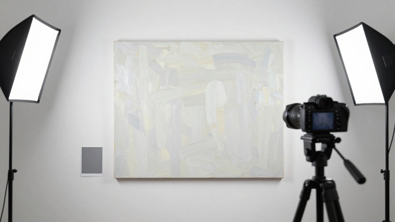
- Lighting that doesn’t lie - Natural light is tempting, but it’s unpredictable. Overcast days? Great. Direct sun? Harsh shadows and glare ruin texture. Most galleries use continuous LED panels with 5000K color temperature-cool white, neutral, no yellow or blue cast. Two lights at 45-degree angles from the artwork’s center eliminate reflections and flatten shadows evenly.
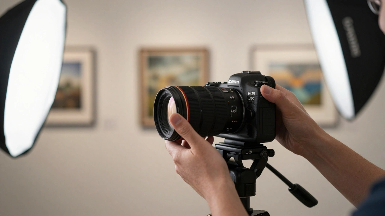
- Camera settings that capture detail - Use a full-frame DSLR or mirrorless camera. Set aperture to f/8 for maximum sharpness across the frame. Shoot in RAW format. No JPEG. You need every bit of data to recover highlights in white frames or shadows in dark canvases. ISO stays at 100. Shutter speed? Around 1/60s with a tripod. Always use a tripod. Handheld shots of art? No.
- Color accuracy that matches reality - This is where most DIY attempts fail. A painting might be a deep cobalt blue in person but appear purple in photos. Why? White balance. Always use a gray card or X-Rite ColorChecker in the first shot. Then set custom white balance in-camera. Post-processing? Never just auto-adjust. Manually tweak hue, saturation, and luminance for each color channel. Your goal: if someone sees the photo and says, “That’s exactly how it looked in the gallery,” you’ve done your job.
Web vs. Print: Different Rules, Same Goal
You might think, “I’ll just take one photo and resize it.” That’s a mistake. Web and print need different treatments.
For the web: Images should load fast without losing quality. Resize to 1920px wide at 72 DPI. Compress with WebP format-it’s 30% smaller than JPEG with identical quality. Use alt text like “‘Eclipse’ oil on canvas, 36x48 in., by Maria Chen” so search engines and screen readers understand what they’re seeing.
For print: File size matters. Save as TIFF or high-quality PNG. No compression. 300 DPI minimum. If you’re printing a 24x30 inch catalog page, your image file should be at least 7200x9000 pixels. That’s not a phone photo. That’s a 45-megapixel camera with a 50mm macro lens.
Here’s the kicker: galleries that maintain separate web and print versions of their images see 25% more print sales. Why? Because when collectors hold a catalog with crisp, rich detail, they don’t just imagine owning the piece-they feel like they already do.
What to Avoid at All Costs
Even pros make these mistakes:
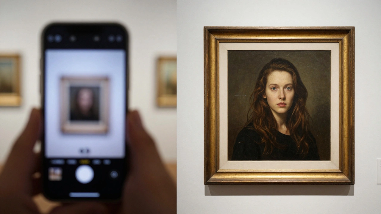
- Shooting through glass - If the artwork is behind glass, reflections will ruin everything. Use a polarizing filter on your lens and shoot at an angle. Or better yet-remove the glass during the shoot. Most galleries can do this safely for a few hours.
- Using auto exposure - The camera’s meter gets confused by white frames or black backgrounds. It underexposes dark pieces and overexposes light ones. Manual mode gives you control.
- Ignoring the frame - A warped wooden frame or chipped gold leaf? Don’t crop it out. Capture it. The frame is part of the artwork’s history. If it’s distracting, note it in the description: “Original 19th-century gilded frame.”
- Editing too much - Don’t turn a muted pastel into a neon explosion. Don’t sharpen edges until they look digital. Art photography isn’t fashion photography. Subtlety wins.
Tools That Actually Work (No Fluff)
You don’t need a $10,000 studio. But you do need the right tools:
- Camera: Sony A7 IV, Canon EOS R6 II, or Nikon Z6 II - all handle low light and color well.
- Lens: 50mm f/2.8 macro. It’s flat, sharp, and distortion-free. Avoid wide-angle lenses-they warp edges.
- Lighting: Godox LED panels (two 60W units) with diffusers. No strobes. They’re too harsh.
- Color calibration: X-Rite ColorChecker Passport. Spend $150 on this. It saves you hours of guesswork.
- Software: Adobe Lightroom Classic. Use the “Artwork” preset. Then fine-tune manually. Don’t use Photoshop for color correction unless you’re trained. Lightroom is enough.
Real-World Example: A Portland Gallery’s Turnaround
A small gallery in Portland, Oregon, had 120 pieces in their online collection. Most were shot on iPhones. Traffic was low. Sales? Nonexistent. They hired a local photographer who specialized in fine art. Here’s what changed:
- Images were shot with a tripod, dual LED lights, and a gray card.
- Each piece got two files: one web-optimized (1920px), one print-ready (8000px).
- Alt text included artist name, medium, dimensions, and year.
Three months later, website traffic doubled. Email inquiries jumped 65%. Two pieces sold to collectors who said, “I saw the photo, and I had to see it in person.” The gallery didn’t change its collection. It changed how it showed it.
Final Thought: Your Art Deserves Better Than a Snapshot
Art isn’t just something you hang on a wall. It’s a story. A moment. A conversation between the artist and the viewer. If your photos don’t do justice to that, you’re not just failing to sell-you’re silencing the artist.
Professional gallery photography isn’t about having the fanciest gear. It’s about respect. Respect for the work. Respect for the viewer. And respect for the fact that people can’t walk into your gallery every day. So you bring the gallery to them-clearly, accurately, beautifully.
Get it right, and your art doesn’t just get seen. It gets felt.
Can I use my smartphone to photograph art for my gallery website?
You can, but it’s risky. Smartphones struggle with color accuracy, dynamic range, and low-light detail. A photo taken in a dim gallery might look fine on your screen but appear muddy or purple when printed. For web use, it might pass-but only if you use a tripod, natural daylight, and edit in RAW mode (if your phone supports it). For print, it’s not reliable. Professional gear gives you control. Smartphones give you luck.
How much should I budget for professional art photography?
Most professional art photographers charge $75-$150 per piece, depending on size and complexity. A gallery with 50 artworks might spend $3,000-$7,500 for a full shoot. That includes lighting, editing, and delivering both web and print files. Compare that to lost sales from poor imagery. Many galleries recover that cost in one or two extra sales. It’s an investment, not an expense.
Do I need to remove glass from framed artwork before photographing?
Yes, if you can. Glass causes reflections, glare, and reduces sharpness. Even with a polarizing filter, details get lost. Most galleries temporarily remove glass for photo shoots-especially for oil paintings, watercolors, or pieces with texture. Handle with care, document the frame’s position, and store the glass safely. The difference in image quality is dramatic.
What’s the best file format for printing gallery catalogs?
TIFF is the gold standard for print. It’s lossless, supports high resolution, and preserves color depth. PNG is a solid second choice if TIFF files are too large. Never use JPEG for print-it compresses color and detail, especially in shadows and gradients. Always save a master TIFF, then export JPEGs for web use.
Should I photograph artwork in color or black and white?
Always shoot in color. Even if the artwork is monochrome, the texture, tone, and subtle shifts in gray matter. Black and white conversions can be done later in editing, but you lose critical data if you shoot in B&W mode. Color gives you flexibility. It also helps viewers understand the artist’s palette-something essential for buyers.