Virtual Exhibition Design: How to Translate Physical Shows Online
When a physical exhibition closes, the art doesn’t just disappear. But for most museums and galleries, the experience does. Visitors can’t walk through the halls, stand in front of a painting, or feel the space between sculptures anymore. That’s where virtual exhibition design comes in - turning static displays into living, breathing digital experiences that people can explore from anywhere.
It’s not just about taking photos of artwork and putting them on a website. A real virtual exhibition needs structure, pacing, lighting, sound, and even crowd behavior. Think of it like directing a movie where the audience controls the camera.
Start with the story, not the tech
Too many institutions jump straight into 3D modeling or VR headsets. That’s backwards. Before you touch a single line of code, ask: What story are we telling? Why does this exhibition matter?
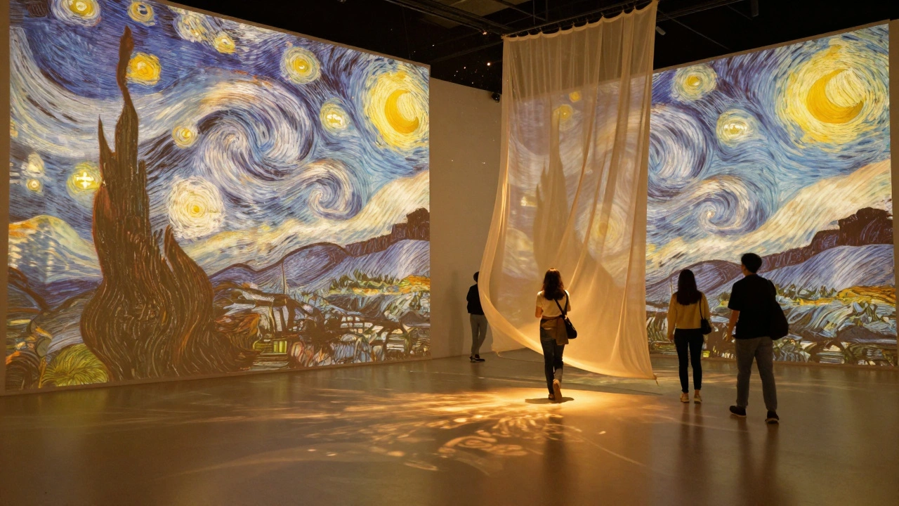
Take the Van Gogh: The Immersive Experience tour that started in Paris and went global. It didn’t just show paintings - it projected them onto walls, synced music to brushstrokes, and used scent diffusers to recreate the Provence air. The digital version kept the same emotional arc: loneliness, passion, light. That’s the core. The tech just carries it.
Every virtual exhibition needs a narrative spine. Is it about rediscovery? Controversy? Innovation? The digital version must deepen that, not dilute it.
Design the visitor’s journey
In a physical gallery, people move naturally. They linger. They circle back. They bump into strangers and start talking. Online, you lose all that.
So you have to rebuild it.
Start with a clear path. Don’t just dump 50 artworks into a flat grid. Group them by theme, chronology, or emotion. Use subtle animations - a slow fade between rooms, a gentle breeze that moves a virtual curtain - to guide attention. Add audio cues: footsteps echoing as someone enters, a whisper of curator commentary when they pause too long in front of a piece.
One museum in Amsterdam redesigned their online exhibit using a “walk-and-stop” rhythm. Visitors could only move forward after spending 45 seconds in each zone. The result? Engagement time jumped from 2.1 minutes to 7.8 minutes.
Make it tactile
Touch is gone in virtual spaces. But you can simulate it.
Let people zoom into brushstrokes. Click on a sculpture to see its internal structure. Hover over a textile to hear the sound of its weave. Use haptic feedback on mobile devices - a soft vibration when they “touch” a fragile artifact.
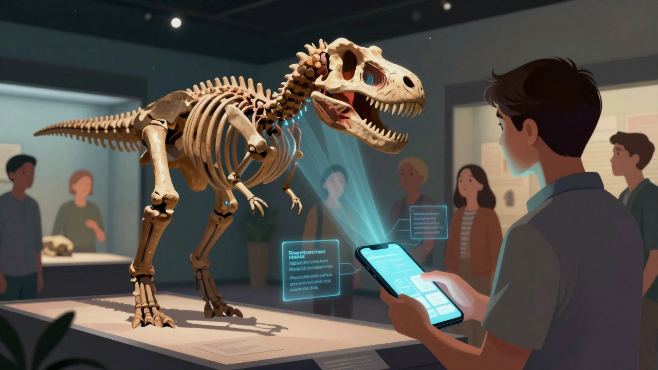
The Smithsonian’s Digitized Dinosaur exhibit lets users rotate a T. rex skeleton, then tap to see its muscle reconstruction. It’s not just learning - it’s discovery. People spend 12 minutes on average on that single artifact. That’s longer than most entire physical exhibits.
Don’t just show objects. Let them be handled. Let them be understood.
Sound matters more than you think
Most virtual exhibitions use silence or generic ambient music. Big mistake.
Sound creates space. A cathedral echo tells you you’re in a large room. Distant chatter says you’re in a crowded hall. The rustle of paper as someone flips through a digital archive? That’s intimacy.
The Tate Modern’s online exhibit for Yayoi Kusama: Infinity Mirrors used layered audio: a soft hum from the mirrors themselves, distant footsteps, and the occasional giggle of a child - all recorded from real visitors. People said they felt like they were there. Not watching. Being.
Record real sounds from your physical show. Use binaural audio. Let visitors hear the world around the art.
Don’t forget the social
Exhibitions aren’t meant to be solo experiences. People go with friends. They argue about meaning. They take selfies.
Virtual exhibitions can do this too.
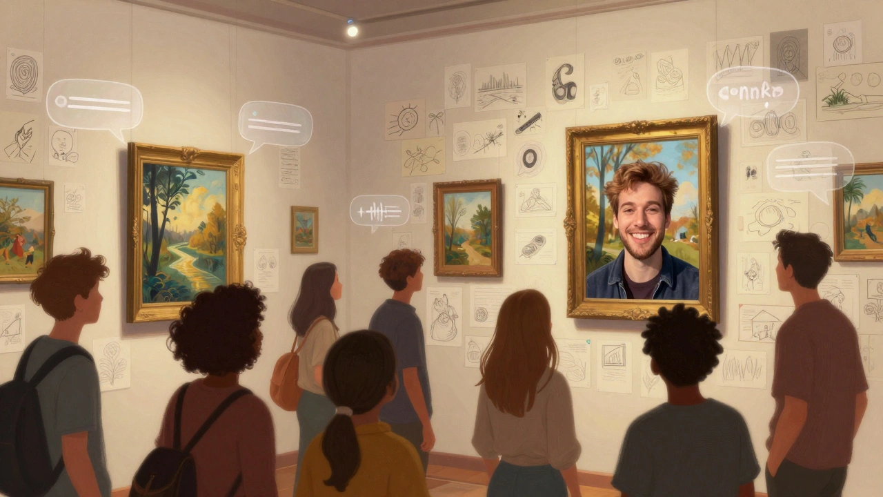
Embed live chat bubbles next to each artwork. Let users leave voice notes. Create shared annotation tools - like a digital sticky note wall where visitors can pin thoughts. The Guggenheim’s Art in the Age of the Internet exhibit let users draw on the walls of the virtual space. Over 12,000 drawings were left in two weeks.
Even simple things help: a “share your reaction” button that generates a short video clip of the user’s face (opt-in) as they describe what they’re seeing. It turns passive viewers into participants.
Accessibility isn’t an add-on - it’s the foundation
A physical gallery might have ramps and braille labels. A virtual one needs alt text that tells the story, not just the object. It needs captions that match tone. It needs keyboard navigation that doesn’t feel like a chore.
One rule: if you can’t describe it in 10 seconds to someone who can’t see it, you haven’t designed it right.
Use descriptive audio tours. Let users adjust contrast, font size, and movement speed. Offer a simplified version for cognitive load. These aren’t nice-to-haves. They’re what make your exhibition inclusive - and legally safe.
Use real data to improve
Physical museums track foot traffic. Virtual ones track clicks, pauses, scrolls, and heatmaps.
Track where people spend time. Where do they drop off? Do they revisit certain pieces? Are they using the zoom tool on the same three artworks over and over? That tells you what’s working.
The Louvre noticed that 70% of visitors to their online Mona Lisa exhibit zoomed into her smile - and stayed there for 3 minutes. So they added a pop-up: “What do you think she’s thinking?” with options to vote. Over 400,000 responses came in. That’s engagement.
Use this data. Don’t just collect it. Change your exhibit based on it.
Keep it fresh
A physical exhibit runs for three months and closes. A virtual one can live forever - but only if you keep it alive.
Add new commentary every month. Release behind-the-scenes videos. Let guest curators take over a room for a week. Host live Q&As with artists. Turn static content into a living archive.
The Getty Center does this well. Their Art of the Ancient World exhibit updates monthly with new artifact scans, scholarly notes, and even AI-generated interpretations. It’s not just a copy of the physical show. It’s an evolving conversation.
What you lose - and what you gain
You won’t replicate the smell of old wood in a museum. You won’t feel the weight of a bronze statue. You won’t bump into someone who says, “I think this is about grief.”
But you gain something bigger: access. A student in rural Kenya can explore the same Egyptian mummy as someone in Tokyo. A person with mobility issues can tour a gallery without stairs. A child in Bolivia can zoom into the brushstrokes of a Van Gogh.
Virtual exhibition design isn’t about replacing the physical. It’s about expanding it. Making art not just visible - but reachable.
Tools that actually work
You don’t need Unreal Engine or a $50,000 VR rig. Many successful virtual exhibitions use simple tools:
- Artivive - for AR overlays on printed images
- Google Arts & Culture - free, scalable, and used by over 2,000 institutions
- Sketchfab - for 3D object viewing with zoom and rotation
- WebXR - browser-based VR without downloads
- Notion + Airtable - for organizing content and managing updates
Start small. Test one room. Measure engagement. Then scale.
Final thought: It’s not about the screen - it’s about the soul
Technology is just a bridge. The real goal is to keep the soul of the exhibition alive.
A painting doesn’t lose its meaning just because it’s viewed on a phone. A sculpture doesn’t become less powerful because someone rotates it with their thumb.
What matters is that someone, somewhere, feels something. That’s the only metric that counts.
Can I create a virtual exhibition without a big budget?
Yes. Many museums start with Google Arts & Culture, which lets you upload high-res images and basic metadata for free. Use Sketchfab for 3D objects, and free tools like Canva or Figma to design navigation. The key is not spending money - it’s spending time on storytelling and user experience.
How do I keep people from just scrolling past my virtual exhibit?
Give them a reason to stop. Add interactive elements: clickable details, hidden audio clips, or puzzles tied to the art. Use pacing - don’t let users rush. Limit movement to one step at a time, like a guided tour. People stay longer when they feel like they’re discovering something, not just browsing.
Do I need VR headsets for a good virtual exhibition?
No. In fact, most people won’t use them. Over 90% of virtual exhibition traffic comes from phones and laptops. Focus on responsive web design that works on any screen. Save VR for special experiences - like a 360° walkthrough of a collapsed temple - not the main exhibit.
What’s the biggest mistake in virtual exhibition design?
Treating it like a website. A virtual exhibition isn’t a digital brochure. It’s an environment. It needs atmosphere, rhythm, and emotional flow. If it feels like a PDF with buttons, people will leave. If it feels like walking into a room where the art is breathing, they’ll stay.
How do I measure success for a virtual exhibition?
Don’t just count visits. Track depth: average time spent, number of zooms, how many people leave comments or share their experience. Look at repeat visits. If people come back, you’ve created something meaningful. Also, track accessibility usage - how many use audio descriptions or keyboard navigation? That tells you if you’re truly inclusive.