Principles of Art: Mastering Balance, Contrast, Movement, and Unity
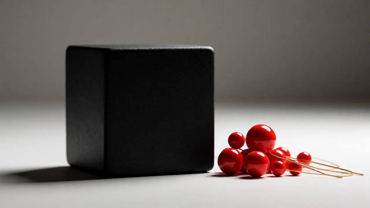
You’ve looked at a painting and felt something was off, but you couldn’t quite put your finger on it. Or maybe you stared at a photograph that just grabbed your attention instantly, even if the subject was mundane. That invisible force pulling you in or pushing you away? It’s not magic. It’s Principles of Art. These are the structural rules that guide how artists arrange elements to create harmony, tension, or chaos. Whether you’re sketching in a notebook, designing a website, or critiquing a masterpiece in a museum, understanding these core concepts changes how you see everything.
Most people confuse the elements of art (like line, shape, color) with the principles. Think of elements as ingredients-flour, sugar, eggs. The principles are the recipe instructions. You can have all the right ingredients, but if you don’t follow the method, you end up with a mess. Today, we’re breaking down four heavy hitters: Balance, the distribution of visual weight, Contrast, the arrangement of opposite elements, Movement, the path the viewer's eye takes, and Unity, the sense of wholeness. Once you get these, you’ll never look at a blank canvas-or an empty room-the same way again.
Why Principles Matter More Than Talent
Talent is often overrated. Sure, some people have better hand-eye coordination, but anyone can learn to make good work by applying structure. When you ignore principles, your art feels random. It lacks direction. Viewers get confused because their eyes don’t know where to go first. Principles solve this. They act as traffic cops for the human eye.
Consider advertising. A billboard has three seconds to communicate its message. If the designer doesn’t use contrast to highlight the product name against the background, you miss it. If they don’t use movement to lead you from the image to the call-to-action button, you walk away without buying. This isn’t just about pretty pictures; it’s about communication efficiency. Artists who master these rules control the narrative. They decide what you notice, when you notice it, and how long you stay engaged.
Balance: Distributing Visual Weight
Balance is the distribution of visual weight in a composition. It’s not about symmetry, though symmetry is one type of balance. It’s about stability. Imagine a seesaw. If one side is heavier, the other side shoots up. In art, "heaviness" comes from size, color intensity, complexity, or position. A large, dark red circle feels heavier than a small, pale blue square.
There are three main types of balance, and each creates a different emotional response:
- Symmetrical Balance: Both sides mirror each other. This feels formal, stable, and calm. Think of classic architecture like the Parthenon or a wedding invitation layout. It’s safe, but it can be boring if overused.
- Asymmetrical Balance: Different elements balance each other out. One large object on the left might be balanced by several smaller objects on the right. This feels dynamic, modern, and interesting. Most contemporary designs rely on this because it keeps the eye moving.
- Radial Balance: Elements radiate outward from a central point. Sunbursts, flower petals, and mandalas use this. It draws the eye directly to the center, creating a sense of focus and energy.
If your artwork feels lopsided, check your balance. Are you stacking too many dark colors on one side? Move a bright accent to the opposite corner. Suddenly, the whole piece stabilizes. It’s physics, but for your eyes.
Contrast: Creating Interest Through Difference
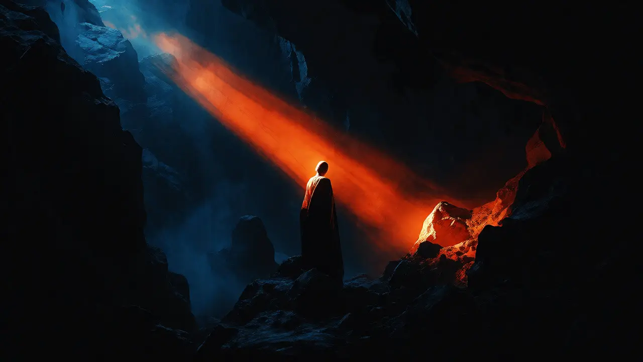
If balance provides stability, Contrast provides excitement. Without contrast, everything blends into a gray mush. Contrast is the difference between two things. It can be light vs. dark, rough vs. smooth, large vs. small, or warm vs. cool colors.
Human brains are wired to notice differences. We evolved to spot a predator in the bushes, which meant noticing a change in pattern or shadow. Artists exploit this biological trait. High contrast grabs attention immediately. Low contrast creates mood and subtlety.
| Type | Description | Emotional Effect |
|---|---|---|
| Value Contrast | Difference between light and dark areas | Drama, depth, clarity |
| Color Contrast | Complementary colors placed together (e.g., red/green) | Vibrancy, energy, tension |
| Texture Contrast | Rough surfaces next to smooth ones | Tactile interest, realism |
| Scale Contrast | Huge objects next to tiny ones | Perspective, emphasis, awe |
A common mistake beginners make is using too much contrast everywhere. If everything is loud, nothing is heard. Use contrast strategically. Make one area high-contrast to serve as the focal point, then let the rest of the piece breathe with lower contrast. This guides the viewer exactly where you want them to look.
Movement: Guiding the Viewer’s Eye
Static images shouldn’t feel static. Movement refers to the path the viewer’s eye takes through the artwork. Artists use lines, shapes, and colors to create an illusion of motion or to direct flow. Even in a still life, you can create movement.
How do you create it? Use implied lines. A figure looking off-canvas makes you look in that direction. Diagonal lines suggest action and instability, while horizontal lines suggest rest. Curved lines feel organic and gentle. Repeating patterns also create rhythm, which is a form of movement. Think of Van Gogh’s The Starry Night. The swirling sky isn’t just decoration; it forces your eye to spin around the canvas, creating a dizzying, energetic experience.
In graphic design, movement is crucial for user experience. Buttons are placed where the eye naturally travels after reading a headline. Arrows, gaze direction of models, and directional lighting all push the viewer toward the desired action. If your audience gets stuck on a detail and misses the main message, your movement strategy failed.
Unity: Bringing It All Together
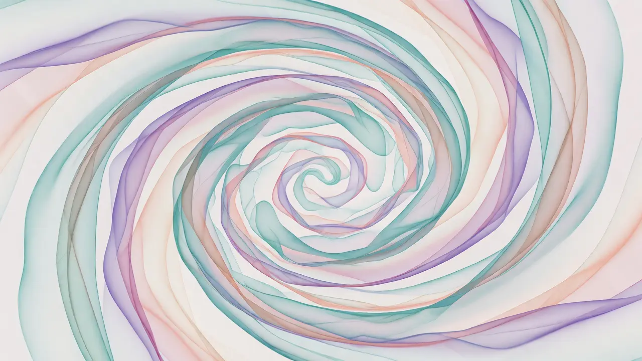
You can have perfect balance, striking contrast, and flowing movement, but if the pieces don’t fit together, the work fails. Unity is the sense that everything belongs together. It’s the glue that holds the composition. Without unity, art looks like a collage of unrelated stickers.
How do you achieve unity? Consistency. Using a limited color palette helps. Repeating specific shapes or textures throughout the piece ties them together. Proximity matters too-objects close to each other are perceived as related. This is known as the Gestalt principle of proximity.
But beware: too much unity becomes monotony. If everything matches perfectly, the eye glazes over. The best compositions balance unity with variety. You want enough similarity to feel cohesive, but enough difference to keep it interesting. This tension between sameness and difference is where great art lives.
Putting It Into Practice
Knowing the definitions is step one. Applying them is step two. Here’s a quick checklist for your next project, whether it’s a digital slide deck or a charcoal drawing:
- Check Balance: Squint at your work. Does one side feel visually heavier? Adjust size or color intensity to fix it.
- Add Contrast: Is there a clear focal point? If not, increase the difference between the subject and the background.
- Trace Movement: Where does your eye start? Where does it end? Add lines or shapes to guide it smoothly across the page.
- Test Unity: Remove one element. Does the piece fall apart? If yes, it was essential. If no, it might be clutter. Ensure remaining elements share a common theme or style.
These principles aren’t rigid laws. They’re tools. Picasso broke them constantly, but he did so intentionally. He understood the rules well enough to break them effectively. Start by following them strictly. Once you feel confident, experiment. Break the balance to create unease. Lower the contrast to evoke sadness. Manipulate movement to confuse. That’s when you stop copying and start creating.
What is the difference between the elements and principles of art?
Elements are the basic components used to create art, such as line, shape, color, value, form, texture, and space. Principles are the guidelines for how those elements are arranged, such as balance, contrast, movement, rhythm, pattern, emphasis, and unity. Think of elements as ingredients and principles as the recipe.
Can I use asymmetrical balance in traditional art?
Absolutely. While classical art often favored symmetrical balance for its sense of order and divinity, asymmetrical balance has been used for centuries to create more natural, dynamic compositions. Japanese ink wash paintings, for example, frequently use vast amounts of negative space to balance a single detailed brushstroke, creating profound visual harmony.
How does color affect visual weight in balance?
Darker, warmer, and more saturated colors generally carry more visual weight than lighter, cooler, and less saturated colors. For instance, a small patch of deep red can balance a larger area of pale yellow. Understanding this allows artists to create asymmetrical balance without relying solely on size differences.
Is contrast always necessary for a successful composition?
While subtle, some level of contrast is usually present in any distinguishable image. However, low-contrast works can be effective for creating mood, atmosphere, or softness. The key is intentionality. If the goal is to create a dreamlike haze, low contrast is appropriate. If the goal is clarity and impact, higher contrast is required.
How do I improve my ability to see movement in art?
Practice tracking your eye’s journey across different artworks. Start with simple compositions and note where your gaze lands first, second, and third. Look for leading lines, directional cues (like faces or arrows), and rhythmic repetitions. Over time, you’ll begin to consciously construct these paths in your own work rather than leaving them to chance.