How to Design Retail Corners in Galleries for Maximum Sales
Imagine walking into a high-end art gallery. The walls are white, the lighting is crisp, and there is a massive painting that demands your full attention. But as you turn a corner, you find a beautifully curated set of limited-edition prints, a designer candle, and a coffee table book-all arranged in a way that feels like a natural extension of the art. That is the power of a well-integrated retail corner. Too many galleries treat their gift shop like a cluttered closet at the end of a hallway, but when you blend commerce with curation, you stop selling "merchandise" and start selling an experience.
Key Takeaways for Gallery Retail
- Blend retail areas into the exhibition flow to avoid "sales shock."
- Use lighting to differentiate between viewing art and shopping for products.
- Keep retail zones organic and open rather than boxed-in.
- Align the product price point with the gallery's prestige.
The Psychology of the Transition Zone
The biggest mistake a gallery owner can make is creating a hard line between the "sacred" art space and the "commercial" retail space. When a customer hits a physical or visual wall that says "Shop Here," their brain switches from an emotional, appreciative state to a transactional one. This often leads to a drop in dwell time.
To keep people engaged, you need a transition zone. Instead of a separate room, think of retail corner design as a gradual shift in density. Start with a few high-value items-like a sculpture that is for sale-and slowly introduce smaller, more accessible products as the visitor moves toward the designated store area. This creates a psychological bridge, making the purchase feel like a way to take a piece of the gallery's soul home with them.
Visual Merchandising is the practice of optimizing the presentation of products to attract customers and stimulate sales. In a gallery setting, this means the merchandise should mirror the aesthetic of the primary exhibition. If the art is minimalist and monochromatic, the retail corner shouldn't be a neon explosion of colorful trinkets.
Mapping the Flow: Where to Place Your Store Area
Placement is everything. If your retail corner is right at the entrance, it looks like a gift shop. If it's tucked in a dead-end corner, it's invisible. The sweet spot is usually the "decompression zone" or the final third of the gallery circuit. By the time a visitor has seen the main collection, they are emotionally invested in the artist's vision. That is when they are most likely to buy a supporting product.
Consider the "Right-Hand Rule." In many cultures, people naturally drift to the right when entering a space. If you place your retail integration on the right side of the final transition, you capture the natural momentum of the crowd. Avoid creating "bottlenecks"-narrow paths where a shopper browsing a shelf blocks the flow of people trying to view the art. Give your retail corners at least six feet of clearance to ensure the space feels airy and luxurious.
| Placement | Pros | Cons | Best For |
|---|---|---|---|
| Entrance Corner | High visibility immediately | Can feel "cheap" or commercial | High-traffic tourist galleries |
| Mid-Exhibition Pocket | Integrates products with themes | Can distract from the art | Thematic or conceptual shows |
| Exit/End Path | Captures post-experience emotion | Some visitors may skip the end | High-end fine art galleries |
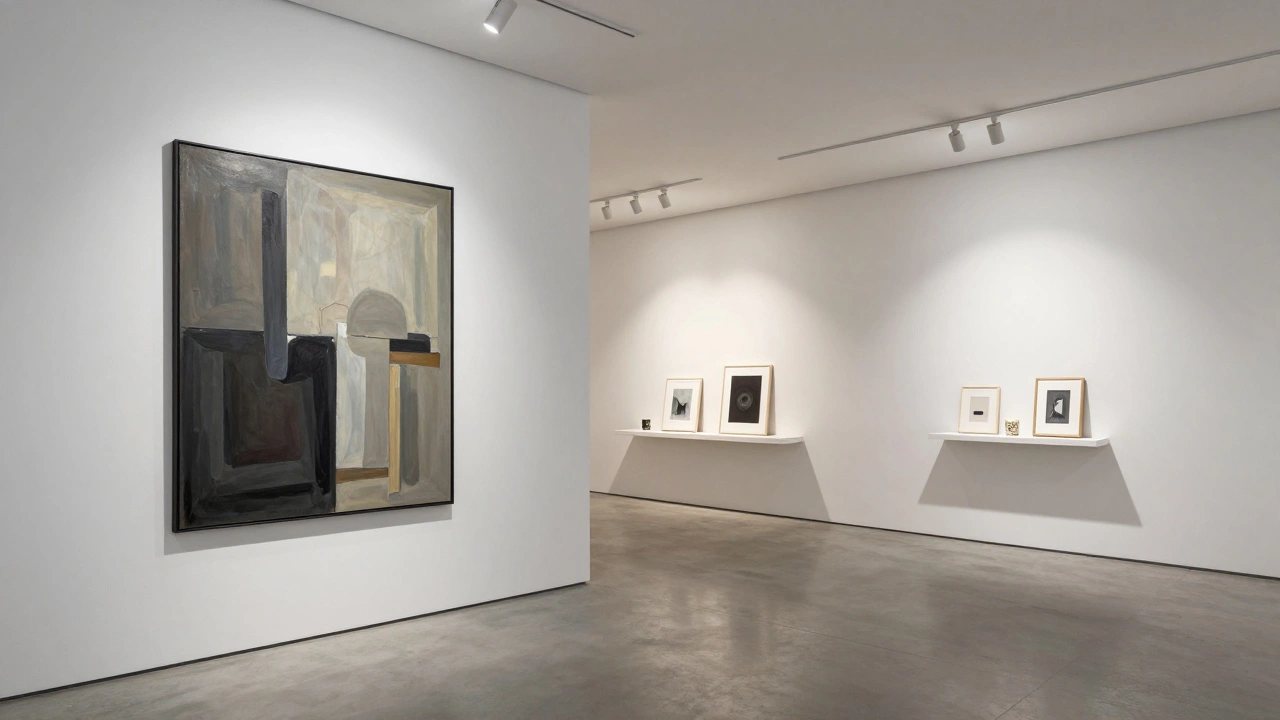
Lighting and Texture: Defining the Shopping Space
You don't need a physical wall to define a retail area; you can use light. While art usually requires focused Spotlighting-which is the use of narrow-beam lights to highlight specific artworks-retail areas benefit from a softer, more ambient glow. When a visitor moves from the high-contrast lighting of a painting to a warmer, diffused light in a retail corner, they subconsciously realize they have entered a different functional zone.
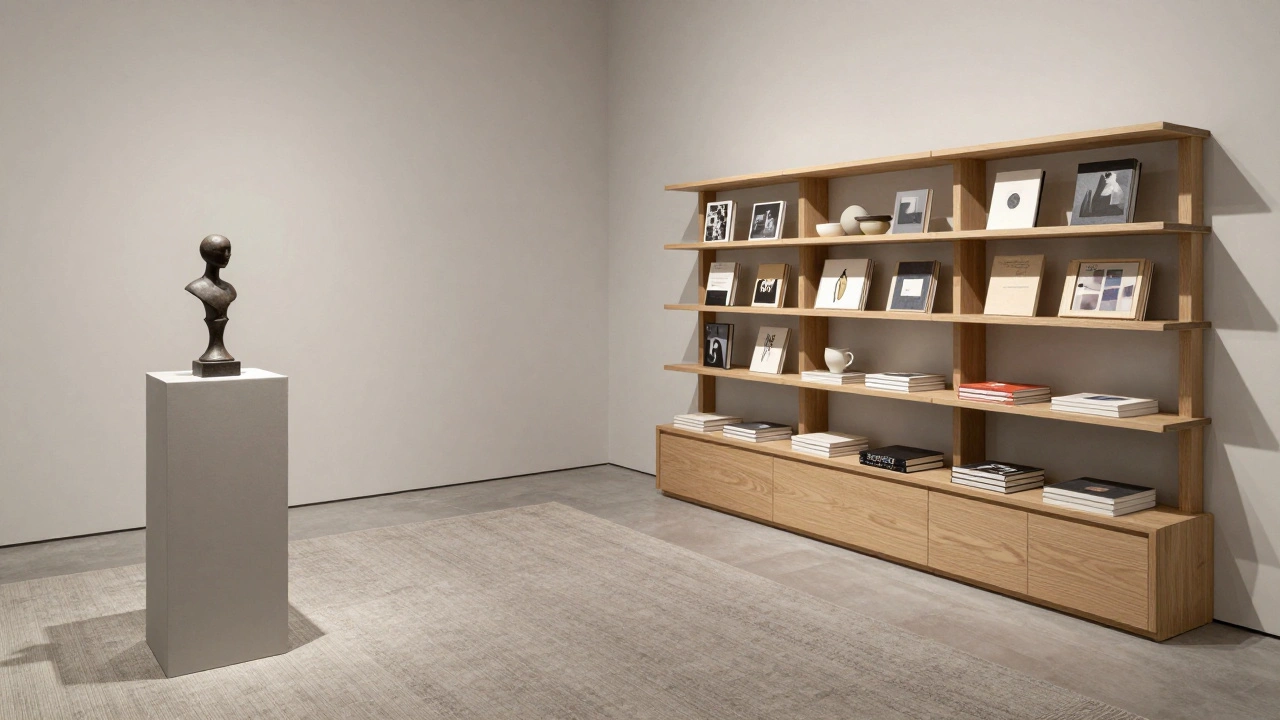
Materials also play a role. If your gallery has polished concrete floors, introducing a high-quality area rug in the retail corner instantly anchors the space. It tells the visitor, "Slow down here." Use shelving that complements the architecture. Floating shelves in the same white finish as the walls keep the look seamless, while reclaimed wood or brass accents can add a touch of "boutique" warmth that makes the products feel more tactile and desirable.
Curating the Product Mix for Integration
What you sell is just as important as how you display it. The products in your retail corner should be an extension of the art's narrative. If a gallery is showcasing immersive digital art, selling a book on the history of pixels or a sleek, branded USB drive makes sense. If it's a landscape painting exhibition, artisan botanical prints or locally sourced ceramics fit the mood.
Avoid the "souvenir trap." Avoid generic items that could be found at any airport. Instead, focus on three tiers of pricing:
- The Impulse Buy: Stickers, postcards, or small prints (Under $20).
- The Thoughtful Gift: Hardcover books, high-end candles, or limited-run accessories ($20 - $100).
- The Collector's Entry: Signed lithographs or small original studies ($100+).
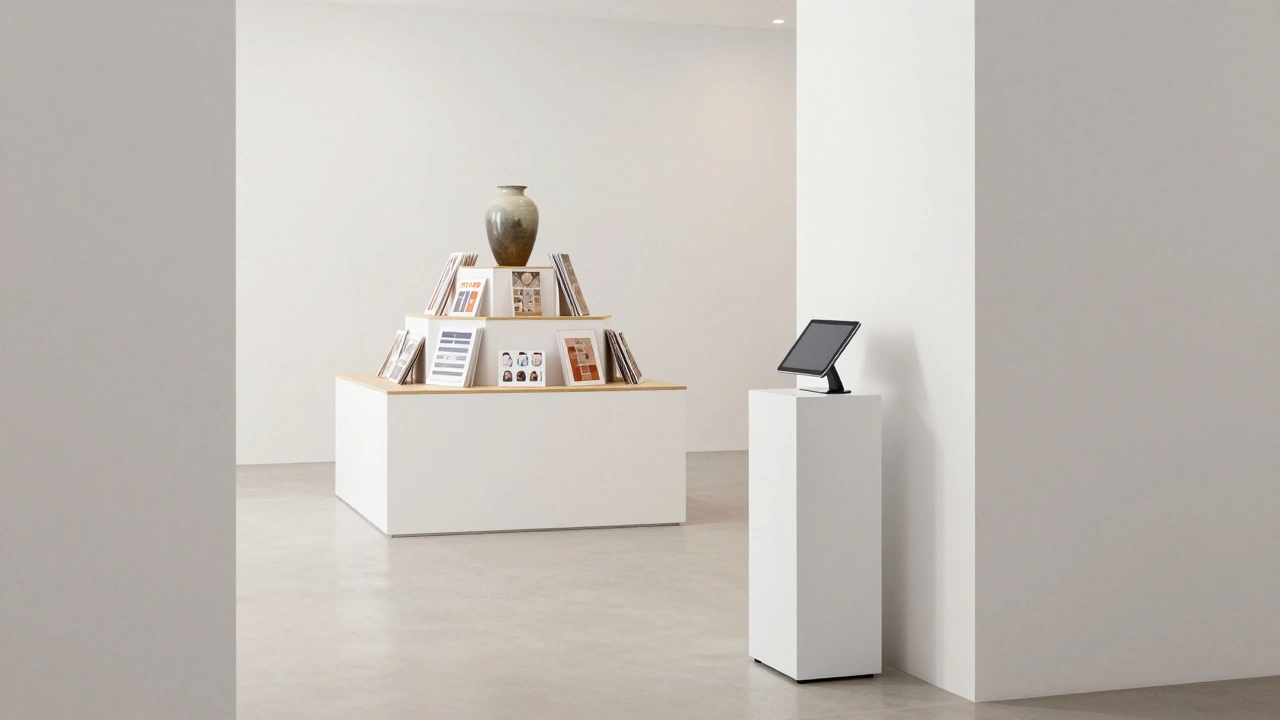
Managing the Point of Sale (POS)
Nothing kills a gallery's vibe faster than a giant, plastic cash register and a messy pile of shopping bags. The point of sale should be as invisible as possible. A small, minimalist pedestal with a tablet-based system is far superior to a traditional checkout counter. This keeps the focus on the art and the experience, not the transaction.
Place the POS System (Point of Sale) in a spot where the staff can oversee both the retail corner and the main gallery floor. This allows the employee to act as both a docent and a salesperson, blending the two roles. When the transition from talking about a painting's technique to processing a credit card is seamless, the customer feels like they are receiving a service, not being sold a product.
How do I stop the retail area from distracting visitors from the art?
The secret is in the visual hierarchy. Ensure the art is always the brightest and largest element in the room. Keep retail shelving below eye level or tucked into natural corners so they don't compete for the center of the viewer's gaze. Use a color palette for the store area that is a muted version of the gallery's main colors.
What is the best way to organize products in a small gallery corner?
Use the "pyramid method." Place your largest, most eye-catching item at the peak and arrange smaller items around it. This draws the eye in and encourages browsing. Avoid overcrowding; leave plenty of "white space" between products to maintain the gallery's feeling of exclusivity and breathability.
Can I use retail corners to promote new artists?
Absolutely. Integrating a "Featured Emerging Artist" shelf within your retail area is a great way to introduce new talent without committing a full wall to them. It allows visitors to interact with the artist's smaller works-like sketches or zines-before moving toward their larger installations.
How often should I change the products in the retail corner?
Your retail mix should rotate with your exhibitions. When the art changes, the merchandise should too. This gives returning visitors a reason to stop by the shop again and ensures that the products always feel relevant to the current mood of the gallery.
What materials are best for gallery retail shelving?
Depending on your brand, acrylic (for a modern, invisible look), powder-coated steel (for an industrial feel), or light oak (for a warm, organic vibe) work best. The key is consistency-don't mix too many textures, or the corner will look cluttered rather than curated.
Next Steps for Gallery Owners
If you are looking to overhaul your space, start by sketching your current floor plan and marking the "heat map" where people linger most. If you find a dead zone that people walk past quickly, that is your prime candidate for a retail corner. Experiment with a "pop-up" style arrangement first-use a few floating shelves and a single light fixture-to see how visitors react before investing in permanent fixtures. Remember, the goal isn't just to sell a product, but to extend the artistic conversation into the visitor's home.