Gallery Storefront Design: Maximizing Street Presence and Window Impact
Your gallery’s window is its first handshake. If a passerby doesn’t stop within three seconds, they’re gone. In the competitive landscape of commercial real estate in urban art districts, your storefront design serves as the primary filter for foot traffic conversion determines whether you get a casual glance or a committed visitor. It’s not just about aesthetics; it’s about psychological triggers that compel action.
Many galleries treat their exterior like a sealed box, revealing only what happens inside once the door opens. This is a missed opportunity. The street is your most valuable advertising space, available 24/7 without ad spend. You need to treat the facade with the same strategic rigor as your interior layout.
The Psychology of the Glance
Human attention on the street is fragmented. Pedestrians are walking, talking, or looking at phones. Your goal is to interrupt this flow. Research in visual perception suggests that high-contrast elements and human faces capture attention fastest. For an art gallery, this means your window display needs to create a narrative gap-a question the viewer wants answered by entering.
- Contrast: Dark interiors with bright focal points draw the eye inward.
- Scale: Oversized elements visible from a distance anchor the view.
- Movement: Subtle motion (like rotating displays or digital screens) breaks static patterns.
Avoid clutter. A crowded window signals chaos, while a curated selection signals value. Think of the window as a headline, not a body text. It should promise quality, not list inventory.
Window Display Strategies That Convert
How you arrange art in the window matters more than the art itself. Here are three proven approaches:
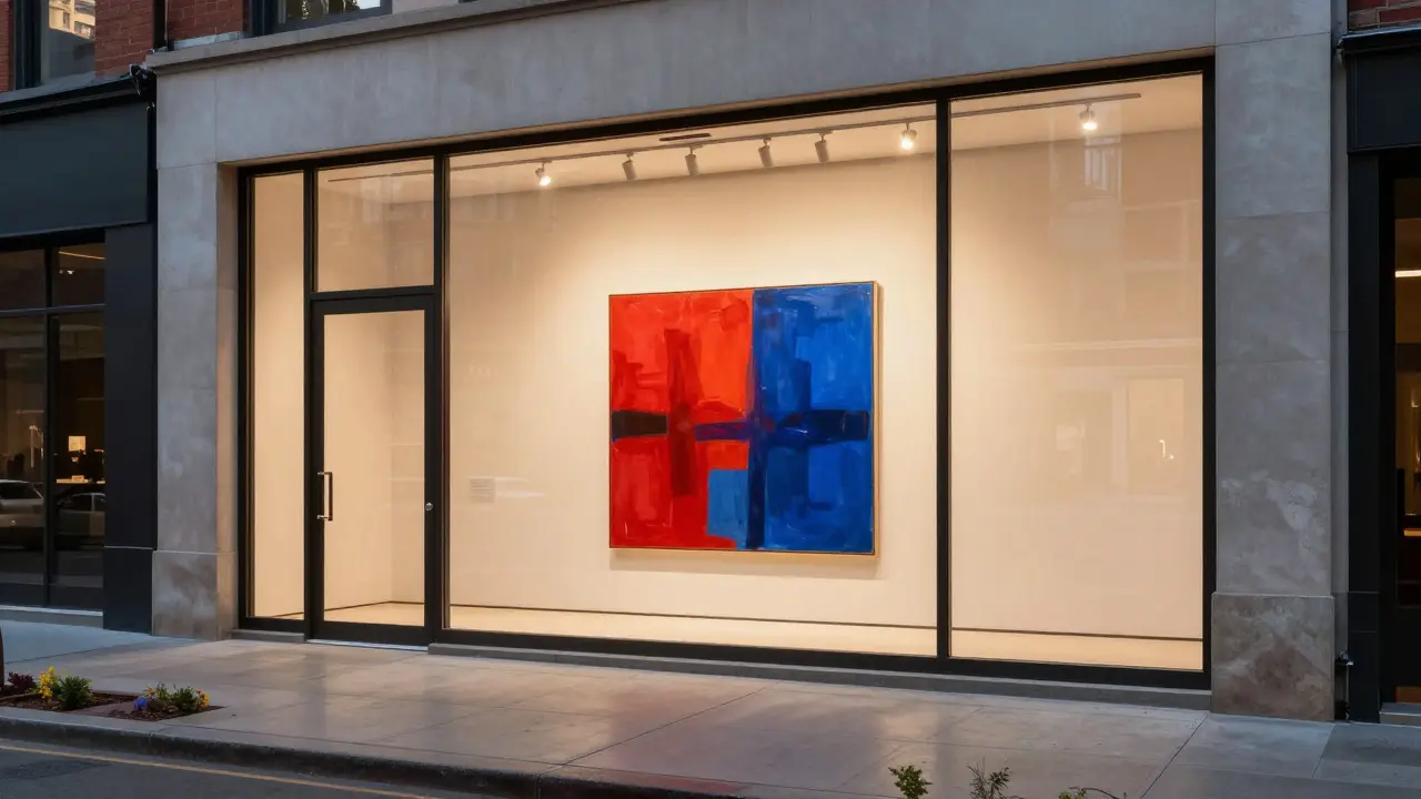
- The Hero Piece: One large, striking work centered at eye level. This creates immediate impact and establishes the gallery’s taste. It works best for bold, colorful, or text-heavy pieces.
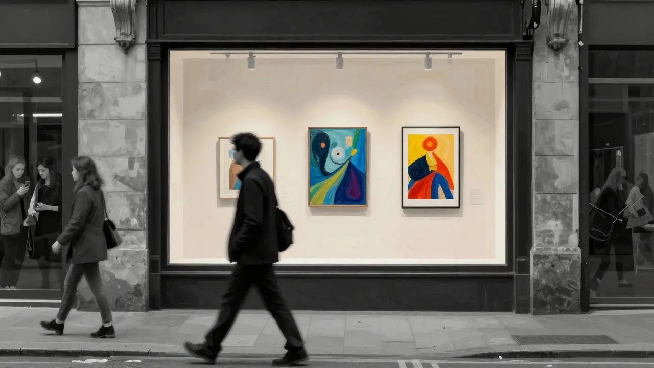
- The Narrative Cluster: Three to five smaller works arranged to tell a story or show a thematic connection. This invites closer inspection and suggests depth.
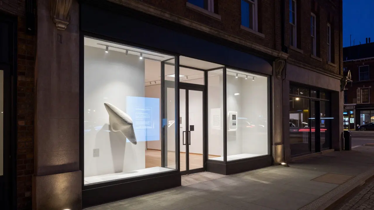
- The Interactive Element: A digital screen, a changing light setup, or a physical object protruding slightly from the glass. This adds a layer of engagement that static frames lack.
Rotate these displays every two to four weeks. Freshness drives repeat glances from regulars and new curiosity from newcomers. Consistency in lighting and framing across rotations builds brand recognition.
| Strategy | Best For | Risk | Rotation Frequency |
|---|---|---|---|
| Hero Piece | Bold, single-item sales | Lacks depth if piece is weak | Monthly |
| Narrative Cluster | Thematic exhibitions | Can look busy if poorly spaced | Bi-weekly |
| Interactive Element | Youth audiences, tech-forward brands | Higher maintenance cost | Weekly updates |
Lighting: The Invisible Architect
Lighting is half the battle. Poor lighting makes even great art look dull. Daylight changes throughout the day, so your artificial lighting must complement natural light rather than fight it. Use LED track lighting with adjustable color temperatures. Warm white (3000K) feels inviting and artistic; cool white (4000K) feels clean and modern. Match the temperature to your gallery’s brand identity.
Direct light onto the art, not the glass. Glare kills visibility. Use anti-glare lenses or angle fixtures to minimize reflections from passing cars and buildings. At night, your window becomes a beacon. Ensure the interior is well-lit enough to be seen from the street, but avoid harsh spotlights that feel aggressive. Aim for a glow that says “come in,” not “look here.”
Signage and Branding Integration
Your logo and name are part of the storefront design, but they shouldn’t dominate. Place signage where it reinforces the art, not competes with it. Minimalist typography works best for contemporary galleries. Avoid neon unless it’s a core part of your brand aesthetic. The sign should be readable from 50 feet away but elegant up close.
Consider dynamic signage. Digital displays can show upcoming events, artist names, or social media handles. This keeps the message fresh without replacing physical art. Just ensure the digital content aligns with the physical display’s tone. A mismatch between a serious painting and a playful digital ticker confuses the audience.
Curb Appeal and Exterior Details
Don’t ignore the sidewalk, door handle, or building facade. These details signal how much care you put into the experience. Clean windows are non-negotiable. Dust smudges reflect badly on professionalism. Keep the entrance clear of debris or promotional flyers. A tidy threshold invites entry; a cluttered one repels it.
If your gallery is in a historic building, preserve architectural character while updating materials. Use durable, weather-resistant materials for any exterior additions. Planters with seasonal flowers add life and soften hard lines. But keep them low-profile so they don’t block the view into the window.
Measuring Success
How do you know if your storefront design is working? Track foot traffic before and after changes. Install simple counters or use staff logs. Monitor social media mentions-do people post photos of your window? If yes, your design is visually compelling enough to share. Also, ask visitors how they found you. If many mention “saw your window,” your street presence is effective.
Adjust based on data. If certain types of displays drive more entries, double down. If one strategy fails, pivot quickly. Storefront design is an ongoing experiment, not a one-time project.
Frequently Asked Questions
How often should I change my gallery window display?
Every two to four weeks is ideal. This keeps the display fresh for regulars and interesting for new passersby. Align changes with exhibition openings or seasonal themes for maximum impact.
What is the best lighting color temperature for art galleries?
Warm white (3000K) is generally preferred for creating an inviting atmosphere. However, match the temperature to your brand identity. Contemporary galleries may prefer cooler tones (4000K) for a cleaner look.
Should I use digital screens in my window?
Yes, if it fits your brand. Digital screens allow for dynamic content like event announcements or artist interviews. They attract attention through movement but require regular content updates to stay engaging.
How important is cleanliness for street presence?
Extremely important. Smudged windows or dirty sidewalks signal neglect. Cleanliness directly impacts perceived value and professionalism. Make daily cleaning a standard practice.
What if my gallery is in a low-traffic area?
Focus on visibility from a greater distance. Use larger scale elements and brighter lighting to catch eyes further away. Consider adding directional signage or banners to guide potential visitors toward your entrance.