Gallery Reception Design: Creating Welcoming First Impressions
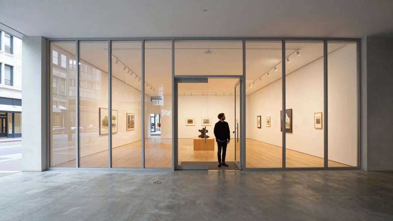
Walk into a gallery where the entrance feels like a maze, the lighting is harsh, and the air smells stale. You leave within two minutes. Now imagine walking into a space that feels open, calm, and inviting, where the path to the first artwork is clear and the atmosphere makes you want to stay. That difference isn't magic; it's gallery reception design. It is the strategic arrangement of the entry zone that sets the emotional tone for the entire visit.
Most people think about art when they think about galleries. But the physical environment often matters more than the paintings on the walls. If the reception area fails to welcome visitors, even the most stunning collection can feel inaccessible or intimidating. This guide breaks down how to craft an entry space that works as hard as your curators do.
The Psychology of the Threshold
The threshold is the moment a visitor transitions from the outside world into the curated space. Psychologically, this is a high-stakes moment. Visitors are deciding whether to commit time and energy to exploring. A poorly designed threshold creates friction. A well-designed one creates anticipation.
You need to manage three key psychological triggers:
- Orientation: Can the visitor immediately understand where they are and what to do next? Confusion leads to anxiety.
- Comfort: Does the space feel safe and pleasant? Harsh acoustics or poor temperature control signal neglect.
- Invitation: Does the layout suggest movement forward? Dead ends or cluttered pathways stop momentum.
In Portland, Oregon, where natural light and organic materials are cultural staples, this means leaning into transparency. Use glass partitions or open sightlines to show the interior before the visitor fully commits to entering. This reduces the "unknown" factor and lowers the barrier to entry.
Lighting: The Silent Curator
Lighting does more than illuminate; it directs attention. In a gallery reception, you have two competing goals: making the space navigable and preserving the mood. Too bright, and you lose the intimate atmosphere. Too dim, and visitors feel lost or unsafe.
Avoid using a single overhead source. Instead, layer your lighting:
- Ambient Light: Soft, diffused general lighting to eliminate shadows in walkways. Aim for 10-15 foot-candles for navigation without glare.
- Task Lighting: Focused light on the information desk, map, or ticket counter if applicable. This should be slightly brighter than ambient light to draw the eye.
- Accent Lighting: Subtle highlights on architectural features or transitional art pieces near the entrance. This bridges the gap between the lobby and the main exhibition space.
Color temperature matters too. Warm white (2700K-3000K) feels welcoming and human. Cool white (4000K+) feels clinical and sterile. For a welcoming first impression, stick to the warmer end of the spectrum unless your brand identity specifically demands a modern, tech-forward vibe.
Spatial Flow and Wayfinding
If a visitor has to think about where to walk, you've failed. The path from the door to the first exhibit should be intuitive. Use floor patterns, changes in material, or subtle shifts in ceiling height to guide movement.
Consider the "S-Curve" vs. the "Straight Line." A straight line is efficient but can feel rushed. An S-curve encourages slower movement and allows for glances at peripheral elements. For most commercial or public galleries, a gentle curve that leads the eye toward the focal point (the main exhibition) works best.
Keep the primary pathway clear of furniture. Place seating areas off to the side, not in the middle of the flow. If you must place objects in the path, ensure they are low-profile and clearly distinguishable from obstacles. Tripping hazards are the fastest way to ruin a positive impression.
Materiality and Texture
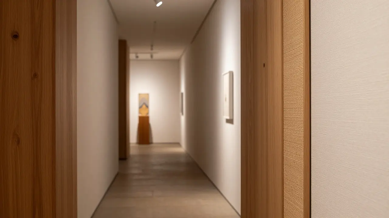
Visuals engage the eyes, but touch engages the mind. Even if visitors don't touch the walls, seeing varied textures adds depth and interest. A wall of smooth concrete feels industrial and cold. A wall with woven fabric panels or reclaimed wood feels warm and approachable.
Mix materials to create contrast. Pair hard surfaces like stone or polished concrete with soft elements like carpeting, upholstered benches, or wooden planters. This tactile variety signals that the space was thoughtfully assembled, not just built.
Incorporate local materials where possible. Using regional wood or stone connects the gallery to its community. It tells visitors, "This place belongs here." It also supports sustainability, a value increasingly important to modern audiences.
Acoustics and Air Quality
People rarely complain about noise until it's gone. But silence isn't always the answer either. Total silence can feel oppressive. You need a background hum that masks distracting noises like HVAC systems or street traffic.
Use acoustic panels disguised as art. Fabric-wrapped panels on walls or ceilings absorb sound while adding visual texture. Alternatively, introduce a low-level soundscape. Soft instrumental music or nature sounds (like distant rain or birdsong) can mask unpleasant noises and enhance the calming effect.
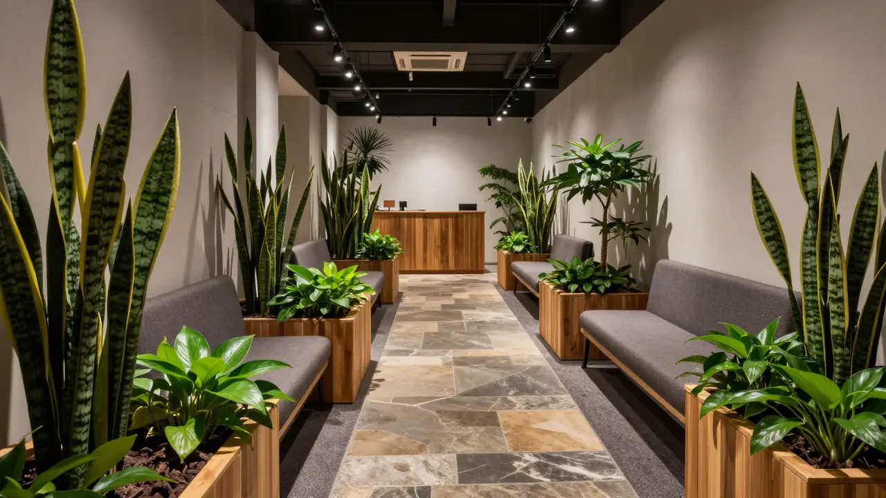
Air quality is equally critical. Stale air makes people feel sluggish and anxious. Ensure proper ventilation. Add live plants to improve air purification and add a biophilic element. Plants soften hard edges and bring life into the static environment. Just be careful with allergies; use hypoallergenic species like snake plants or pothos.
Comparison of Design Approaches
Different gallery types require different reception strategies. Here’s how to tailor your design based on your specific context:
| Design Element | Commercial Retail Gallery | Public Museum/Institutional | Private/Boutique Studio |
|---|---|---|---|
| Primary Goal | Conversion/Sales | Education/Accessibility | Exclusivity/Intimacy |
| Lighting Tone | Bright, Energetic (4000K) | Warm, Neutral (3000K) | Moody, Accent-Focused (2700K) |
| Wayfinding | Direct, High-Contrast Signage | Intuitive, Multi-Language Maps | Minimal, Staff-Guided |
| Furniture | Durable, Easy-to-Clean | Accessible, Comfortable | Curated, Statement Pieces |
| Atmosphere | Urgent, Inviting | Calm, Educational | Exclusive, Personal |
Notice how the lighting temperature shifts dramatically between these models. A retail gallery needs brightness to encourage browsing and purchasing. A private studio uses lower light to create a sense of exclusivity and focus. Choose your approach based on who you are trying to attract.
Common Pitfalls to Avoid
Even experienced designers make mistakes in the reception area. Watch out for these:
- The Clutter Trap: Placing too many brochures, maps, or promotional items on the front desk. Keep it minimal. One map, one pen, maybe a small plant. Less is more.
- Ignoring the View Out: If you have windows, don't block them. Natural light and views of the street connect the interior to the exterior. Blackout curtains kill the welcoming vibe.
- Overlooking Accessibility: Ensure wide pathways for wheelchairs. Place information desks at accessible heights. Add tactile guides for visually impaired visitors. Inclusion is part of welcoming everyone.
- Static Decor: If the same flowers or posters have been there for six months, it looks neglected. Rotate decorative elements seasonally to keep the space feeling fresh and current.
Next Steps for Implementation
Ready to redesign your gallery reception? Start with an audit. Walk through your space as a stranger. Note where you hesitate, where the light feels wrong, or where the path is blocked. Take photos. Then, prioritize one change. Maybe it's swapping out the harsh overhead lights for warm LED strips. Maybe it's clearing the clutter from the front desk. Small changes yield big results. Test the new setup with a few trusted visitors and ask for honest feedback. Iterate. The goal is a space that feels effortless, so visitors can focus on what really matters: the art.