Gallery Entrance Design: How to Create a Powerful First Impression
Key Takeaways for a Winning Entry
- The Threshold Effect: Use a transition zone to reset the visitor's sensory input.
- Lighting as a Guide: Use contrast and focal points to pull people naturally into the space.
- Clarity Over Clutter: Keep signage minimal and intuitive to prevent "entrance anxiety."
- Accessibility: Ensure the physical path is inclusive for all mobility levels.
Mastering the Psychology of the Transition
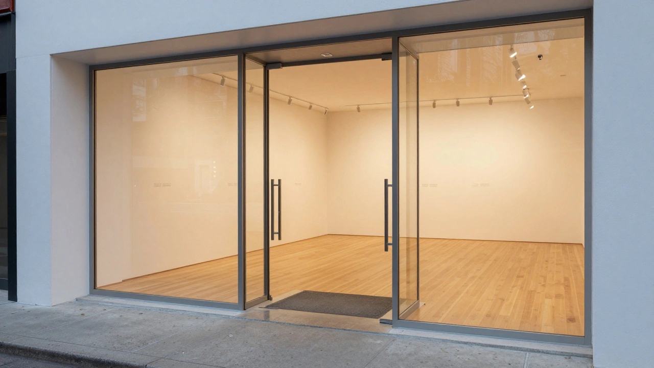
The moment someone steps inside, they undergo a mental shift. Architects call this the "decompression zone." If you throw a masterpiece right at the door, the brain can't process it because it's still adjusting to the change in light, temperature, and sound. You need a buffer space-usually about 5 to 10 feet-where the visitor can pause, breathe, and orient themselves.
Consider the lighting in this zone. If you move from a bright sunny sidewalk into a dimly lit room, the eyes need a few seconds to adapt. By using Ambient Lighting-soft, indirect light that fills the space without creating harsh shadows-you make the transition feel seamless. This is why many world-class museums use a vestibule or a wide, open lobby before the first exhibit hall. It tells the visitor, "You are now entering a different state of mind."
Directing Traffic Without Using Signs
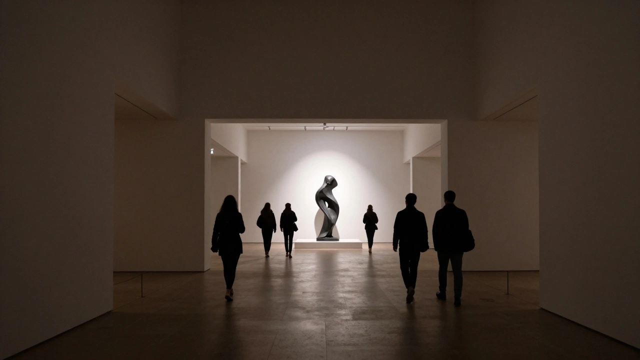
Nothing kills the vibe of a high-end gallery like a giant "ENTER HERE" sign. Instead, use the architecture to do the talking. Human beings naturally follow lines and light. By placing a striking, large-scale sculpture or a brightly lit focal piece slightly off-center from the door, you create a visual magnet that pulls people forward.
The floor material also plays a massive role in Visitor Flow. If you switch from a hard concrete entryway to a softer wood or a textured rug, you're subconsciously telling the visitor to slow down. This change in tactile feedback signals that they have moved from a public transit area to a curated experience. When the path is clear and the pull is natural, people move with confidence rather than confusion.
| Element | Design Choice | Visitor Response |
|---|---|---|
| Ceiling Height | Double-height or Open | Feelings of awe and openness |
| Lighting | High Contrast / Spotlights | Immediate focus and curiosity |
| Color Palette | Neutral / Muted Tones | Reduced stress, focus on art |
| Door Type | Glass / Transparent | Welcoming, lowers entry barrier |
The Role of Lighting in First Impressions
Lighting is your most powerful tool for storytelling. In a gallery, you aren't just illuminating a room; you're directing an experience. For the entrance, avoid the "hospital look"-harsh, overhead fluorescent panels that wash out color and make people feel exposed. Instead, focus on layered lighting.
Start with Accent Lighting. Use directional tracks to highlight the first key piece of art. When a visitor sees a beam of light hitting a canvas in the distance, it creates a sense of mystery and invitation. This technique, often used in galleries like the Tate Modern, encourages exploration. Pair this with low-level wall grazing-lighting that washes the texture of the walls-to give the space a warm, three-dimensional feel.
Don't forget the temperature of the light. 3000K (warm white) creates a cozy, inviting atmosphere, while 5000K (cool daylight) feels sterile and professional. For a gallery entrance, a balance is key. A warm welcome in the lobby that transitions into a crisp, clean white in the exhibition area helps signal the shift from "greeting" to "observing."
Accessibility and the Inclusive Entrance
A powerful first impression is only powerful if everyone can experience it. If a visitor in a wheelchair has to use a side service entrance because the main doors are too heavy or have a small step, you've just told them they aren't the primary audience. True Universal Design integrates accessibility into the beauty of the entrance.
Avoid the "ramp as an afterthought" look. Instead, use a gradual slope that is part of the main architectural path. Automated sliding doors or lightweight pivot doors remove the physical struggle of entering. When the entrance is effortless, the visitor's mental energy remains focused on the art, not on the logistics of getting inside. This inclusive approach doesn't just meet legal codes; it expands your audience and reflects a brand of openness and generosity.
Balancing Branding and Minimalism
Your gallery's logo and name are important, but they shouldn't compete with the art. The goal of the entrance is to get people *into* the experience, not to sell them on the brand before they've seen the work. A common mistake is placing a massive, backlit corporate logo right at the eye level of the door. This can make a gallery feel like a retail store.
Instead, integrate your branding subtly. Use high-quality materials-like etched glass, brushed brass, or carved stone-that match the aesthetic of the art being shown. If you're showcasing minimalist contemporary art, a simple, sans-serif font on a clean white wall is plenty. If you're running a classical gallery, perhaps a traditional plaque is more appropriate. The branding should act as a signature at the end of a letter, not the loud headline of a billboard.
Common Pitfalls to Avoid
Many gallery owners fall into the trap of "over-curating" the entrance. They try to put their best, most expensive piece right by the door to wow people. This often backfires. Because people are still in that decompression phase, they tend to rush past the first piece or crowd around it, creating a bottleneck that blocks the entrance for others.
Another mistake is ignoring the "acoustic entrance." If the lobby echoes like a cavern, it can feel cold and intimidating. Using sound-absorbing materials-like acoustic ceiling baffles or heavy fabric curtains-softens the noise from the street and creates a hushed, reverent atmosphere. When the sound changes, the brain recognizes that the rules of the outside world no longer apply here.
How much space should a gallery decompression zone be?
Ideally, you want a space of 5 to 10 feet between the entry door and the first major piece of art. This gives visitors time to adjust their eyes to the lighting and mentally prepare for the exhibit without feeling crowded by other guests.
What is the best lighting temperature for an art gallery entrance?
A warm white temperature around 3000K is generally best for the immediate entrance to create a welcoming feel. However, as visitors move into the main exhibition area, switching to a cooler, more neutral 4000K to 5000K ensures that the colors of the artwork are represented accurately.
How can I handle security and ticketing without ruining the design?
Should I use glass doors or solid doors for a gallery?
Glass doors are generally superior for galleries because they provide "visual permeability." When a passerby can see a glimpse of the interior or a stunning piece of art, the psychological barrier to entry is lowered, making the space feel more accessible and inviting.
Does the floor material really affect the visitor's mood?
Yes. Tactile changes signal changes in environment. Moving from a hard, noisy sidewalk to a soft rug or polished hardwood tells the visitor's brain to slow down and shift into a more observant, quiet mode, which is essential for appreciating art.
Next Steps for Improving Your Space
If you're looking to upgrade your current entrance, start by standing outside your door for ten minutes. Watch how people approach the building. Do they hesitate? Do they look confused? This observation will tell you more than any blueprint.
If you notice a bottleneck at the door, look at your focal points. Move your first piece of art further into the room to create a natural draw. If the space feels cold, experiment with warmer lighting in the first five feet of the entryway. Small, incremental changes in lighting and layout often yield the biggest results in how people feel when they first encounter your collection.