Curatorial Sightlines: Mastering Spatial Rhythm in Design
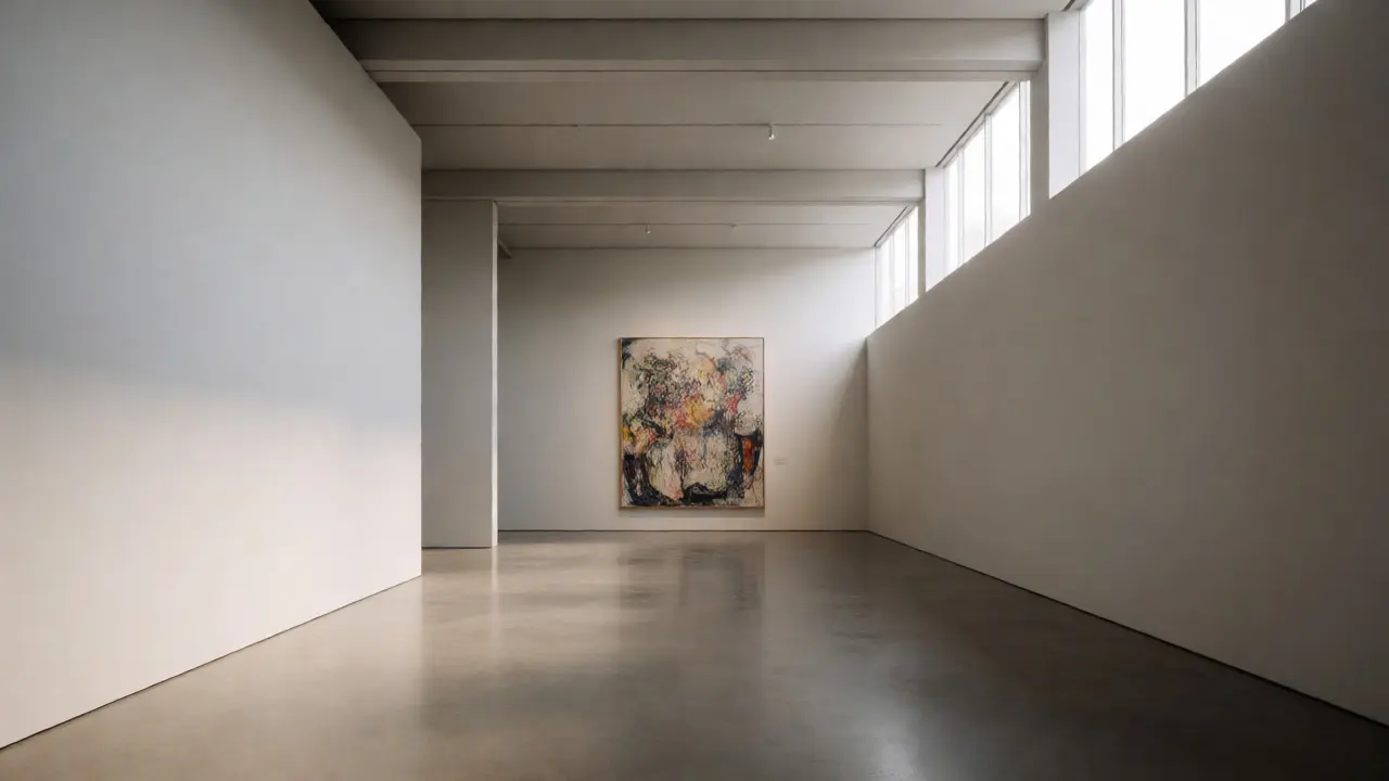
You walk into a gallery, and something feels off. You don't know why. The art is good. The lighting is fine. But your eyes dart around like a lost puppy, and you leave feeling scattered rather than moved. That disconnect? It’s usually a failure of curatorial sightlines. These are the invisible paths your eye travels through a space, guided by placement, height, and distance.
Think of an exhibition not as a collection of objects, but as a sentence. If the words (artworks) are jumbled, the meaning gets lost. Spatial rhythm is the grammar that makes the sentence readable. It controls the pace at which visitors move, pause, and absorb information. When you master this, you stop just hanging pictures or placing sculptures. You start directing attention with precision.
What Are Curatorial Sightlines?
A sightline is the direct line of vision from a viewer’s eye to a focal point. In museum design, it’s about controlling what people see first, second, and last. Most designers focus on floor plans. They measure square footage. But they forget that humans experience space vertically and horizontally simultaneously.
Consider a typical entryway. If every wall screams for attention with large, colorful works, the visitor experiences cognitive overload. Their brain shuts down. Effective sightlining creates hierarchy. One piece dominates the view from the entrance. Others wait their turn. This isn’t just aesthetic; it’s psychological. We process visual information sequentially, even if we think we’re taking it all in at once.
Visual Hierarchy relies on three tools: scale, contrast, and position. A small sketch next to a massive canvas will disappear unless you use lighting or framing to elevate its status. Without intentional sightlines, the largest object always wins, regardless of curatorial intent. You might want viewers to notice the delicate ink drawing first, but if the oil painting behind it is twice the size, the ink loses. Every time.
The Mechanics of Spatial Rhythm
If sightlines are the path, spatial rhythm is the tempo. It’s how fast or slow a visitor moves through the room. Fast rhythms feel urgent, chaotic, or exciting. Slow rhythms feel contemplative, heavy, or solemn. You choose the rhythm based on the story you’re telling.
How do you control speed? Distance and density. Place artworks far apart, and visitors linger. They read labels. They sit. They stare. Pack them tight, and visitors rush. They scan. They skip. They get anxious. There’s no right answer, only the right fit for the content.
Imagine a retrospective on a tortured artist like Francis Bacon. Tight spacing, dim light, and close proximity create claustrophobia. The rhythm matches the subject’s inner turmoil. Now imagine a minimalist show of Agnes Martin. Wide gaps, white walls, and silence invite breath. The rhythm expands. The body relaxes. The mind clears.
| Spacing Strategy | Visitor Pace | Cognitive Load | Best For |
|---|---|---|---|
| Dense (1-2 ft gaps) | Fast / Scanning | High | Historical timelines, data-heavy exhibits |
| Moderate (4-6 ft gaps) | Walking / Reading | Medium | General galleries, mixed media |
| Sparse (8+ ft gaps) | Slow / Lingering | Low | Monographs, high-value originals, meditative spaces |
This table isn’t gospel, but it’s a solid starting point. Notice how "Cognitive Load" correlates with pace. High load doesn’t mean bad. Sometimes you *want* to overwhelm the viewer to make a political statement. But you must be deliberate about it.
Building Narrative Through Sequence
Stories need beginnings, middles, and ends. Exhibitions often fail because they treat every room as an island. Visitors wander randomly. The narrative dissolves. To fix this, use sightlines to tease the future.
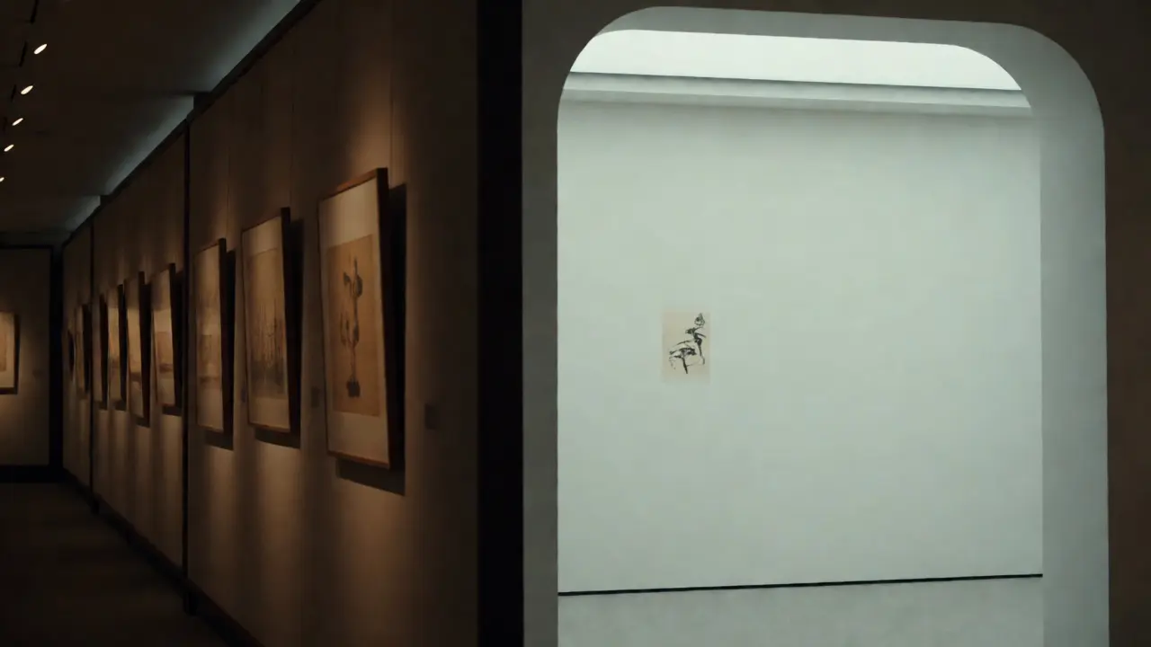
Open doors or archways act as frames within frames. If you place a striking sculpture visible through a doorway from the previous room, you pull visitors forward. This is the "pull." Conversely, you can use the "push." End a room with a challenging or confusing piece. Visitors feel compelled to move on to resolve the tension. Or, they stay and wrestle with it. Both are valid outcomes if designed intentionally.
Consider the Portland Art Museum’s recent renovations. They didn’t just rearrange paintings. They aligned doorways so that specific pairs of works faced each other across rooms. Walking through Room A, you saw a portrait. Turn around, and Room B showed the sitter’s environment. The narrative jumped rooms. The sightline connected them physically and intellectually.
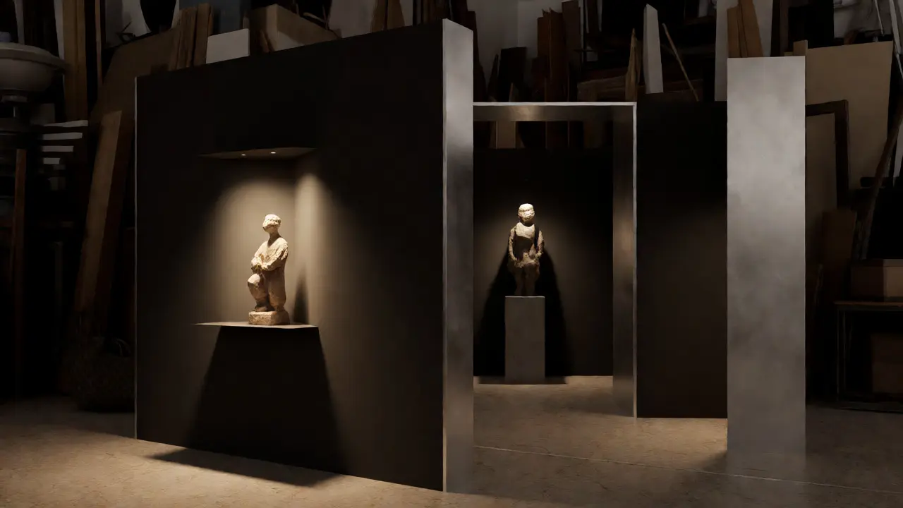
You don’t need expensive construction to do this. Use freestanding partitions. Angle them to block unwanted views and reveal desired ones. Create pockets of intimacy within open halls. A partition angled at 30 degrees can hide a fire exit while highlighting a niche display. Small adjustments yield big narrative gains.
Lighting as a Conductor
You can have perfect spacing and great sightlines, but if the lighting is flat, the rhythm dies. Light directs the eye faster than any label or frame. It creates contrast, which is the primary driver of visual interest.
Use pools of light to isolate key moments. Keep transitional areas dimmer. This guides movement naturally. People gravitate toward light. If you want them to stop and read a long text panel, light it well. If you want them to pass through a corridor quickly, keep it evenly lit but lower intensity. Don’t compete with the art.
Color temperature matters too. Warm light (2700K-3000K) feels inviting and historic. Cool light (4000K+) feels clinical and modern. Mixing them incorrectly disrupts the mood. A warm spotlight on a cold abstract sculpture can make it look muddy. Test your lights before opening night. Always.
Common Pitfalls to Avoid
Even experienced curators fall into traps. Here are the big ones:
- The Wall-to-Wall Error: Filling every inch of wall space leaves no breathing room. Visitors feel pressured. Leave empty space. It’s not wasted real estate; it’s active negative space that gives the eye rest.
- The Label Clutter: Placing long paragraphs directly under small artworks forces readers to stand still while others try to view the piece. Move dense text to side panels or digital kiosks. Keep the immediate sightline clean.
- Ignoring Height Variance: Hanging everything at eye level (57-60 inches) creates monotony. Vary heights to create vertical rhythm. Low pieces require bending; high pieces require looking up. This physical engagement keeps visitors alert.
- The Dead Zone: Corners and backsides of partitions often go unnoticed. Use these spots for low-stakes context or secondary details. Don’t waste prime real estate on minor info.
Another trap is over-curating. Too many arrows, signs, and instructions break immersion. Trust your spatial design. If the layout works, visitors won’t need a map. If they do, your sightlines failed.
Practical Steps for Implementation
Ready to apply this? Start with a simple walkthrough. Stand at the entrance. Close your eyes. Open them. What’s the first thing you see? Is it the most important piece? If not, adjust.
- Map Your Key Works: Identify the top 3-5 pieces that carry the core message. These are your anchors.
- Define Entry Points: Where does traffic enter? Ensure the first anchor is visible immediately, but not necessarily centered. Off-center feels more dynamic.
- Create Pauses: Designate specific zones for lingering. Use benches, rugs, or distinct flooring changes to signal "stop here."
- Test Flow: Walk the path yourself. Then ask someone unfamiliar with the exhibit to walk it. Watch where they stumble, look back, or rush past. Adjust accordingly.
- Refine Sightlines: Use temporary screens to block distractions. See if removing a competing artwork improves focus on the anchor. Often, less is more.
Remember, exhibition design is iterative. Rarely does the first layout nail the rhythm. Be willing to move things. Shift a partition six inches. Change a bulb color. Tweak the angle of a frame. These micro-adjustments compound into a seamless experience.
What is the ideal distance between artworks?
There is no single ideal distance. It depends on the artwork's complexity and the desired visitor pace. For complex, detailed works, allow 6-8 feet to encourage close viewing. For bold, graphic works, 2-4 feet may suffice. The goal is to prevent visual competition while maintaining flow.
How do sightlines affect accessibility?
Clear sightlines help visitors with mobility aids navigate without confusion. Unobstructed views reduce anxiety and decision fatigue. Ensure that primary sightlines do not cross narrow pathways where wheelchairs might block traffic. Also, consider seated eye levels when determining focal points.
Can digital displays disrupt spatial rhythm?
Yes, if poorly integrated. Moving images attract attention involuntarily, breaking the intended pacing. If using screens, place them in transition zones or as background elements, not as primary focal points alongside static art. Alternatively, use motion sensors to activate screens only when visitors approach, preserving the quiet rhythm otherwise.
Does room shape matter for sightlines?
Absolutely. Square rooms offer stable, balanced sightlines. Rectangular rooms create directional flow, pulling eyes toward the far end. Circular rooms eliminate corners, encouraging continuous circulation but lacking strong focal points. Adapt your curation strategy to the architecture, or use partitions to alter the perceived shape.
How do I handle multi-story exhibitions?
Vertical sightlines become critical. Staircases and elevators should offer glimpses of upcoming floors to build anticipation. Avoid placing major works directly opposite stairwells where they might be missed during ascent/descent. Instead, use intermediate landings for brief pauses and contextual information.