Art Gallery Space Design: Layout, Flow, Visitor Experience
Walking into a great art gallery should feel like stepping into a quiet, thoughtful conversation. The art speaks, but the space? It listens. Too many galleries fail here. They cram paintings on every wall, squeeze walkways too tight, or bury the best piece in a dark corner. Visitors leave confused, tired, or worse - bored. Designing an art gallery isn’t about how much you can fit in. It’s about how well you can guide someone through emotion, silence, and discovery.
Layout: Less Is More, But Only If It’s Right
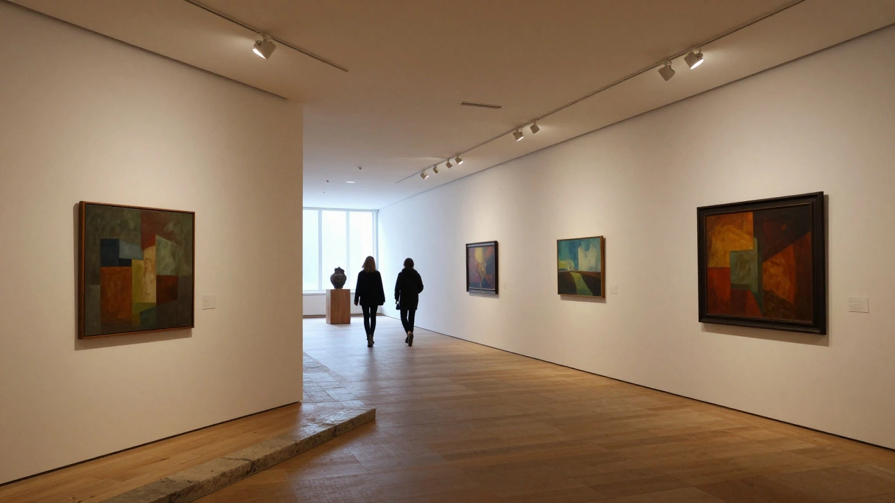
Start with the basics: walls, lighting, and breathing room. A common mistake? Using every inch of wall space. That’s not curation. That’s clutter. Studies from the Museum of Modern Art’s own visitor tracking show that when more than 7 artworks are visible at once in a single view, attention drops by nearly 40%. The human brain can’t process more than 3-5 pieces deeply in one glance.
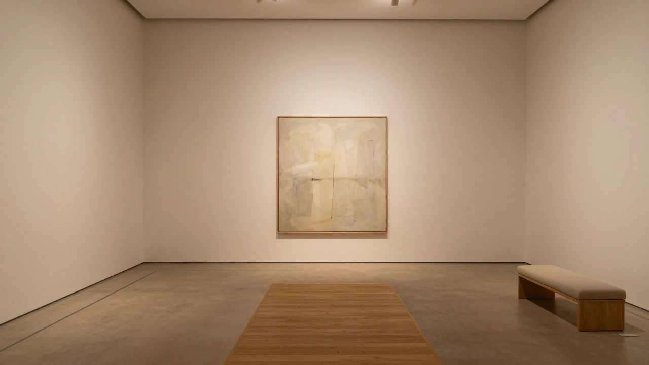
Instead, think in clusters. Group works by theme, color, or artist. Leave 12-18 inches of empty wall between each group. This creates natural pauses. It lets a visitor’s eyes rest. It gives the art room to breathe. Even a single large painting deserves space. A 10-foot canvas doesn’t need neighbors. It needs silence.
Wall height matters too. Most galleries hang art at eye level - around 57 inches from the floor. That’s standard for average-height visitors. But if your space has high ceilings, don’t just hang everything higher. Use the vertical space for large-scale installations or suspended pieces. Let the architecture work with the art, not against it.
Flow: The Path You Don’t Notice
Good gallery flow feels effortless. You don’t think about it. You just move. Bad flow? You hit dead ends. You double back. You get stuck behind a group. It breaks the mood.
The best galleries use a single, clear path. Think of it like a story: beginning, middle, end. Start with something accessible - maybe a bright, familiar piece. Then guide visitors deeper into more challenging work. End with a strong emotional punch - a dark room, a single sculpture, or a window with natural light. That final moment sticks with people.
Width of walkways? Minimum 4 feet. Six feet is better. Two people walking side by side, plus room to pause. Avoid sharp turns. Use gentle curves. If you need to change direction, do it with a small alcove or a change in floor material. A shift from wood to stone tells people: “We’re entering a new zone.”
Don’t forget doorways. They’re not just exits. They’re transitions. A narrow doorway between rooms creates anticipation. A wide, open arch feels like a release. Use them intentionally.
Visitor Experience: It’s Not About the Art Alone
Art is the star. But the experience? That’s the supporting cast. And it’s made of tiny details most galleries ignore.
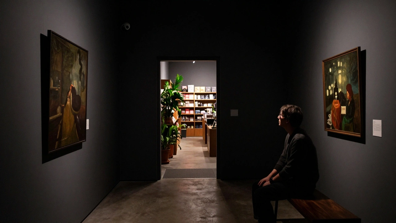
Lighting is the biggest one. LED strips that look clean? Great. But if they cast a blue tint on a red painting? That’s not lighting. That’s distortion. Use 2700K-3000K warm white LEDs. That’s the sweet spot - close to natural daylight without washing out pigments. Dimmable fixtures? Non-negotiable. A Rembrandt portrait needs softer light than a neon installation.
Signage? Minimal. No wall plaques with 10 lines of text. Just the artist’s name, title, and year. If someone wants more, they can scan a QR code. No one reads long captions standing in front of a painting. And never put text directly below the artwork. That blocks the view. Put it to the side, or on a separate panel.
Seating? Yes. Not in the middle of the gallery. But in quiet corners. Two or three chairs near a powerful piece. People need to sit. To stare. To feel. A 2023 study from the Getty Center found that visitors who sat for even 90 seconds spent 3x longer in that room and remembered the artwork 60% better.
Temperature and air quality? Often overlooked. Keep it at 70°F (21°C). Humidity at 45-55%. Too dry? The paint cracks. Too damp? Mold grows. And no one wants to smell air freshener mixed with oil paint.
Flow Hacks That Actually Work
- Use floor markings - subtle lines in wood or tile - to guide movement without signs.
- Place a single bench just before a major piece. People sit. They look. They stay.
- Install motion-sensor lights. They turn on only when someone approaches. It feels magical.
- Put the restroom far enough away that people don’t rush through the gallery. But not so far they give up.
- Soundproofing. Even low-level music or chatter breaks immersion. Use acoustic panels. They’re not ugly. They can be designed as art.
What Not to Do
Don’t use glass cases for everything. It’s safe, sure. But it creates distance. People want to feel close. If you must use cases, keep them low. Let viewers lean in.
Don’t put the gift shop at the entrance. It kills the mood. Place it at the exit - after the experience. People leave with emotion. Then they want to take something home.
Don’t use white walls everywhere. White is clean. But it’s also cold. Try soft greys, warm beiges, or even muted blues. They help the art pop without shouting.
Don’t overcrowd with staff. One person per 500 square feet is enough. Too many guards look like surveillance. Too few? Visitors feel unsafe. Find the balance.
Real Examples That Got It Right
The David Zwirner Gallery in New York uses long, narrow rooms with high ceilings. Each room holds one artist. No distractions. No labels. Just space and art.
The Hayward Gallery in London uses a spiral path that gently rises. Visitors don’t realize they’re climbing until they reach the top - and the best view.
The Chihuly Garden and Glass in Seattle? They use colored glass ceilings and natural light. The space becomes part of the art. No one remembers the layout. They remember how it felt.
These places didn’t try to impress with size. They impressed with calm.
Start Small. Think Big.
You don’t need a 20,000-square-foot building to create a powerful gallery. A 1,200-square-foot space can feel vast if designed with intention. One wall. One window. One piece. That’s enough. Let the visitor lean in. Let them pause. Let them leave changed.
Art galleries aren’t warehouses for paintings. They’re temples of attention. Design them like it.
What’s the ideal size for a small art gallery space?
A functional small gallery starts around 1,000-1,500 square feet. This allows for 8-12 major pieces, proper walking space, a small seating area, and a discreet exit near the gift shop. Anything under 800 square feet becomes cramped unless you use vertical space and mirrors creatively. The goal isn’t to fit more art - it’s to let each piece breathe.
Should I use natural light in my gallery?
Yes - but carefully. Direct sunlight fades pigments. Use diffused light through UV-filtered skylights or indirect windows. North-facing windows are best - they give steady, cool light without harsh shadows. Avoid windows on the south side unless you install heavy shading. Always pair natural light with dimmable LED backups for cloudy days or evening hours.
How do I prevent visitors from crowding around one popular piece?
Place your most popular piece not at the entrance, but near the end of the journey. Use smaller, intriguing pieces at the start to draw people in. Add a bench 6 feet away from the main attraction - it invites people to sit and stay. Install a low, angled mirror nearby so viewers can see themselves in context. Crowds form where there’s no place to pause. Give them a reason to linger, not just to snap a photo.
Do I need a dedicated space for digital art or video installations?
Absolutely. Video art needs darkness. Sound control. And a clear viewing zone. A small room with blackout curtains, a single bench, and a hidden speaker system works better than a corner in a large gallery. Don’t mix video with traditional paintings - the sensory overload breaks immersion. Treat digital work like its own exhibit, not an afterthought.
How important is the entrance and exit design?
Critical. The entrance sets the tone. A grand doorway feels formal. A low, narrow entry creates intimacy. The exit should lead gently to the gift shop or café - not back into the street. People leave with emotion. If the exit feels abrupt, that emotion fades. A transition zone - even just a few potted plants or a bench - helps visitors carry the feeling with them.